
When it comes to choosing the perfect wall color to complement dark wood trim, it’s essential to consider the undertones of the wood and whether they’re warm or cool. The goal is to create contrast without allowing the trim to disappear into the walls, while also avoiding colors that clash with the trim. A balanced interior design is key.
While there may not be a single best paint color that works in every room, selecting a hue that harmonizes with the wood and stain can help create a cohesive look. It’s crucial to develop a color scheme that takes into account the wall color, wood trim, and furniture. The deep undertones at the bottom of a color swatch often work well with natural wood trim. Before making a final decision, it’s helpful to test paint samples in the room to ensure the chosen color complements the dark wood trim.
Ultimately, dark wood trim is an evergreen style that can be paired beautifully with various wall colors, and it’s not out of style.
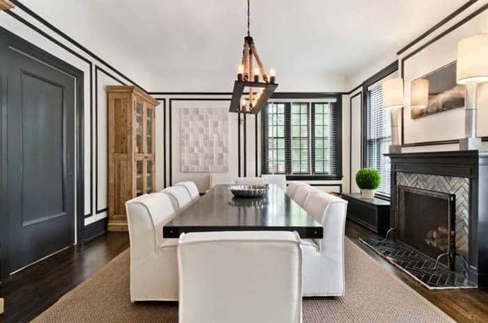
White
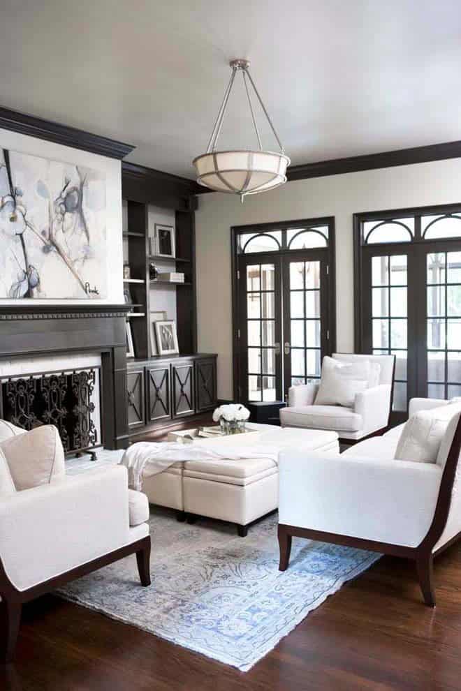
When it comes to pairing white paint with dark wood trim, classic white is an instinctive choice that creates a harmonious balance. The versatility of white walls lies in their ability to reflect natural light, making any space feel brighter and more welcoming. This combination is perfectly showcased in the accompanying image, where the crisp white walls blend seamlessly with the furniture and fireplace surround, creating a sense of cohesion and visual appeal.
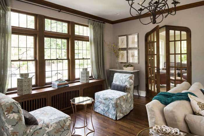
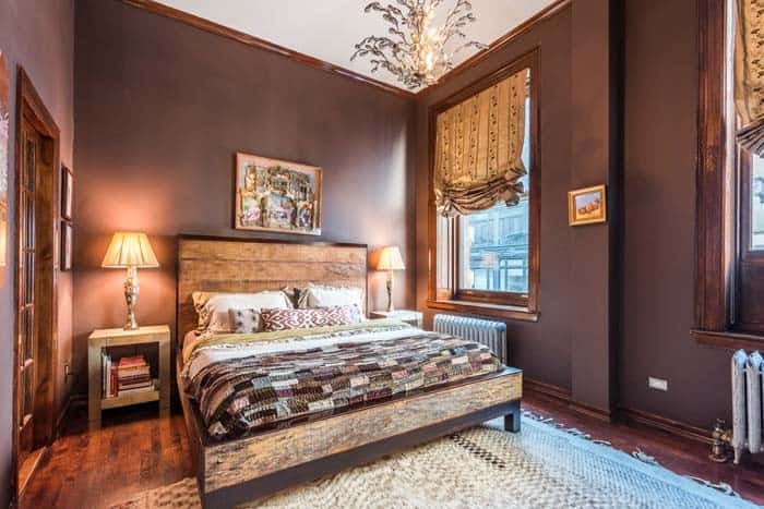
Cream
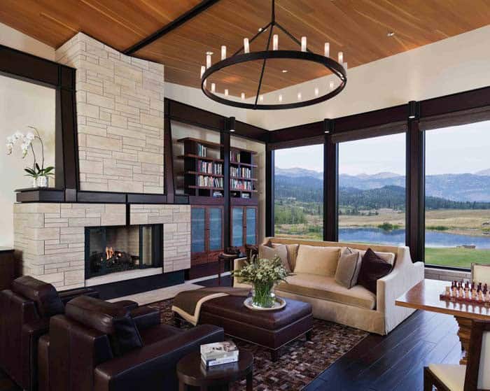
The warm undertones of cream-colored walls can create a cozy atmosphere when paired with trim featuring red undertones, such as mahogany or cherry. This harmonious combination is exemplified in this living room, where the light paint color not only complements the dark wood floors and trim but also provides striking contrast to the vibrant blues and greens visible through the windows, courtesy of the outdoor view.
Light Gray
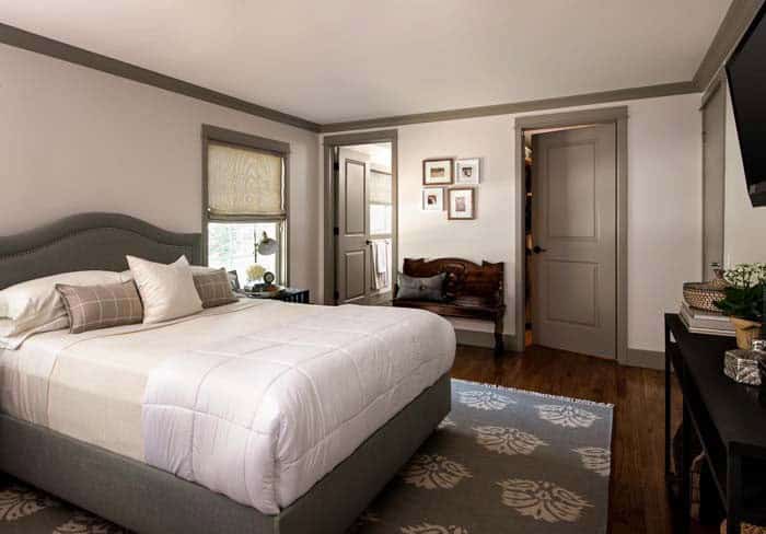
Pairing a light gray paint color with deeper grays creates a harmonious tone-on-tone look, radiating serenity in this neutral-toned bedroom. To maintain the tranquil ambiance, the room’s interior doors are painted to match the dark trim, fostering a sense of continuity. When it comes to choosing wall colors that complement brown furniture, Repose Gray by Sherwin Williams stands out as one of the lightest gray options on the market for interior painting.
Yellow
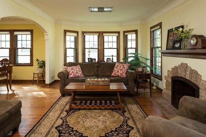
The combination of yellow and dark wood trim is a winning formula for creating a harmonious space. The subtle undertones of yellow within the wood trim, floors, and furniture work together seamlessly. Moreover, this color scheme allows for a beautiful contrast when paired with bold red accents through throw pillows, showcasing a thoughtful design choice.
Beige
Beige’s versatility makes it a popular choice for creating a neutral backdrop in any room. Its undertones can shift towards green, yellow, or pink-orange hues. When pairing beige with dark wood trim, opting for yellow or green undertones is generally recommended, as they tend to complement each other nicely. In contrast, pink undertones may not be the best fit and are perhaps better suited for other design projects.
Gray
While gray may not be the first color that comes to mind when pairing with dark or natural wood trim, it’s definitely worth exploring. By selecting a gray with warm undertones, you can create a cozy and inviting atmosphere in your room, much like the one depicted above. To add depth and visual interest, incorporate textiles that feature these warm tones. One popular option is Agreeable Gray latex paint by Sherwin Williams, which boasts warm undertones that harmonize beautifully with dark trim.
Green
Green, often associated with feelings of calmness and serenity, harmonizes beautifully with dark wood tones, evoking the natural world where leaves rustle in the breeze. Its subtle undertones can shift towards yellow or blue, making it easy to find a shade that seamlessly integrates with your home’s décor.
Turquoise

Turquoise, an earthy hue with a unique blend of blue and green undertones, can effortlessly complement various rooms. While its deep tones harmonize seamlessly with dark trim, it also possesses the ability to unify disparate wood tones, showcasing its versatility.
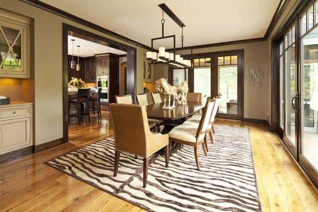
Neutral White
Neutral white paint provides a lavish backdrop for dark trim, allowing every other colour in the room to stand out. This understated shade creates a seamless connection with nearby elements, such as the table and white fabric of the chairs, as seen above. Moreover, it enables the creation of visual interest through light, as the yellow undertones in the fixtures harmonize with those found in the wood floor, rug, and hutch.
Taupe
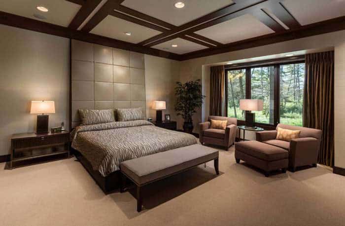
When it comes to neutral colors, taupe is an understated yet versatile choice that deserves a spot in every design enthusiast’s palette. As a wall color, taupe exudes warmth and coziness, making it an excellent candidate for creating a five-star hotel-inspired ambiance in your bedroom. Imagine the soft, gentle hue enveloping you as you drift off to sleep – it’s the epitome of relaxation.
Purple
Purple walls often get a bad rap, but what if I told you that the deeper tones of this majestic hue can bring an air of sophistication and elegance to a room? Think rich, velvety purples instead of neon nightclub vibes. When paired with warm wood tones like red or yellow oak, it’s as if the space is bathed in a warm, golden light. This regal combination feels like a nod to classic luxury, perfect for creating a cozy and inviting atmosphere.
Red
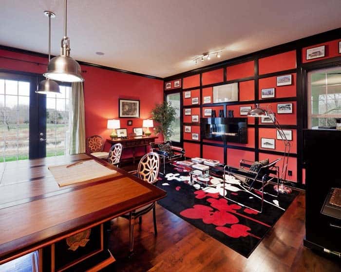
While a bold color choice for a nursery, red walls still pack a punch when it comes to energizing an adult space. A deep, rich shade with orange undertones can bring out the warmth in natural wood trim and create a cozy atmosphere that’s hard to ignore.