Gray-painted rooms have become increasingly popular in home decor, and for good reason – they provide a neutral backdrop that can be easily paired with a wide range of colors. If you’re looking to add some vibrancy to your gray space, consider introducing colorful curtain panels. These can dramatically alter the ambiance of a room, allowing you to create the desired mood or atmosphere. With this in mind, you may be wondering what color curtains complement gray walls best.
While it’s true that gray walls can be paired with any color curtains, it’s essential to consider the undertones present in your wall paint. Grays can have warm or cool undertones, which will impact the overall feel of the room. You’ll want to choose a curtain color that aligns with this undertone and contributes to the desired aesthetic. In addition to considering the undertones, you should also think about the texture of your curtains.
Thicker, more substantial drapes can create a formal, luxurious atmosphere, while lighter, airy options can bring a sense of openness and brightness to the space. If you’re struggling to make a decision, consider consulting with an interior design professional. They’ll work closely with your gray walls to select the perfect curtain color, ensuring that all elements in the room – including furniture and accessories – harmonize seamlessly.
Black
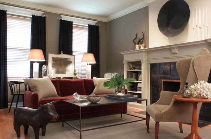
Transforming a space into an opulent retreat is as simple as draping it with black curtains. The sleek, sophisticated aesthetic they bring can elevate even the most mundane rooms to new heights of luxury. In this particular living room, the black curtains perfectly complement the gray walls, creating a cohesive and refined atmosphere. To further enhance the illusion of expansive windows, each rod extends elegantly beyond the crown molding of the frame, subtly drawing the eye outward.
Moreover, these stylish curtains are an excellent option for those seeking blackout solutions, offering a seamless blend of form and function.
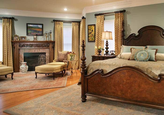
Brown
The enduring appeal of a brown and gray color scheme lies in its ability to seamlessly blend warmth and sophistication. By incorporating brown curtains, you can instantly add depth and coziness to the room, fostering a welcoming ambiance. Moreover, this versatile combination allows for effortless coordination with other hues present in the space, be it furniture or accessories. The result is a harmonious balance that effortlessly transitions between formal and informal settings.
Cream
When it comes to selecting a cream color for your curtains, you can’t go wrong. This warm and inviting hue is perfect for brightening up a room with gray walls. By choosing cream curtains, you’ll create a cozy atmosphere that’s sure to make any space feel more welcoming. Pairing these curtains with a white or light gray bedspread or wall paint will result in a clean and crisp look that’s both soothing and sophisticated.
One of the best things about cream curtains is their ability to complement gray walls with warm undertones, such as those with yellow or red tones. This neutral color combination is especially effective when paired with strategic placement of golden yellow accent pieces throughout the room. Consider adding a pop of warmth with a mirror frame or coffee table in this inviting hue to create a space that’s both cozy and stylish.
Floral Orange
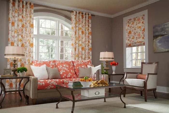
Orange and gray is a striking combination when it comes to color schemes. The vibrant tone of orange can inject life into a room dominated by gray, creating a harmonious balance that adds brightness and energy. This palette also allows for the incorporation of personality-rich elements like floral print curtains featuring orange hues.
These soft, forgiving patterns can pick up on the warm undertones in the gray walls, while the yellow base of the orange color ensures a cohesive look when paired with non-matching couches. A thoughtfully designed space can seamlessly integrate these contrasting colors, much like Abda Custom Window Fashions exemplifies.
Gold Sand
When it comes to pairing gold sand curtains with shades of gray, the key is finding the right balance. While they can work well with any tone of gray, the middle to deeper shades tend to create a more harmonious contrast. The warm undertones in gold sand curtains make them a natural match for analogous colors, while cool undertones provide a striking visual interest. For those seeking a touch of luxury and sophistication, antique gold curtains are an excellent choice.
These elegant drapes can seamlessly integrate into any style home, from traditional to modern settings. Additionally, they complement gray walls particularly well, resulting in a refined and elegant aesthetic that’s sure to impress.
Matching Grays
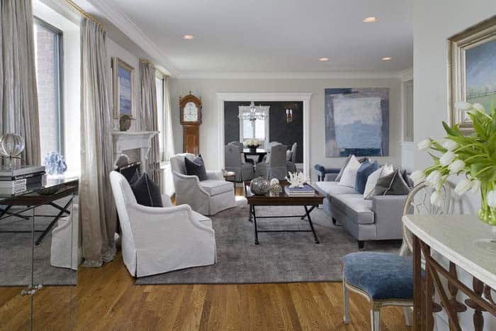
When it comes to selecting curtains, many people assume that they can’t have gray curtains if their walls are also gray. However, we’re here to challenge that notion and show you some options for matching your curtains to your wall. By doing so, you can create a neutral background that provides a perfect backdrop for any accent color. Take, for example, the serene room pictured above.
The blue accent color creates a calming atmosphere, while the wood accent pieces and floor add warmth as they contrast with the cool gray background. In this case, the tone-on-tone effect is achieved using a light pewter gray curtain. Alternatively, consider using charcoal gray curtains to bring sophistication to your room.
Green
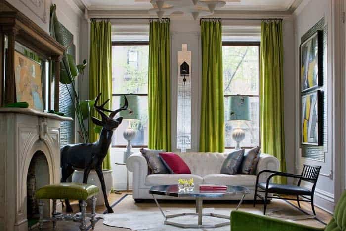
When it comes to adding an organic touch to a room, green curtains are an excellent choice. When paired with gray walls, they create a striking contrast that doesn’t overpower the space. In fact, these curtain panels serve as the dominant accent color in the room. The harmonious combination of green and gray is further enhanced by the presence of a white couch and rug, which appear to float effortlessly in the center of this eclectic living room.
Navy Blue
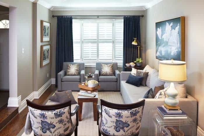
Incorporating navy blue panels into the room design adds a sense of comfort and formality, cleverly creating the illusion that the space is longer than its actual dimensions. The subtle nod to the color is expertly repeated in the toile fabric adorning the backs of the chairs, thoughtfully placed in the foreground to create visual harmony.
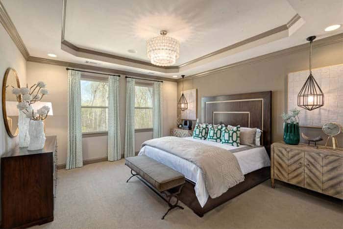
Patterned Light Green
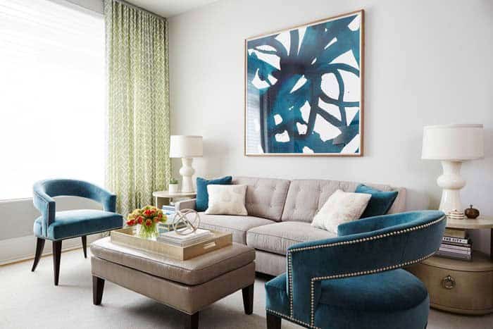
The addition of light green curtain panels brings a secondary accent color into play, beautifully contrasting with the turquoise accents found in the chairs, throw pillows, and painting. Furthermore, the sheer texture of the curtains provides a welcome respite from the abundance of smooth fabrics in the room, injecting a much-needed tactile element to the space.
Pink
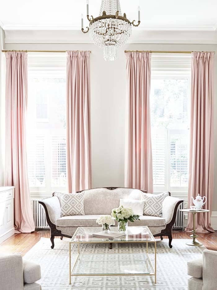
When it comes to adding a touch of personality to your formal living room, consider combining pink curtains with gray walls for a stylish and unexpected pop of color. The dusty rose hue creates a sophisticated statement that can elevate the overall aesthetic of the space. Alternatively, you can also opt for light shades of any other color that complement the light grey walls, creating a harmonious and calming atmosphere.
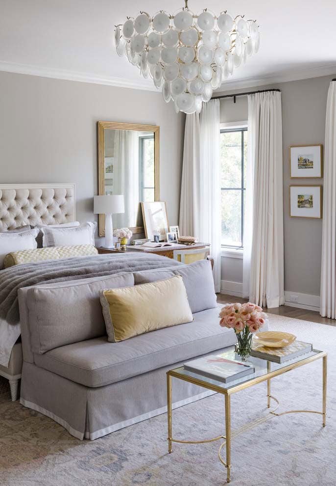
Pure White
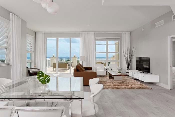
As modern decorating trends continue to evolve, gray and white have emerged as a popular alternative to traditional black and white color schemes. This striking combination is particularly well-suited for coastal-inspired spaces, where crisp whites can be used to create a sense of brightness and airiness. A great example of this aesthetic in action can be seen in the use of pure white curtains, which complemented the white chairs and media console perfectly in this open floor plan design.
The result is a space that feels fresh, clean, and effortlessly chic.
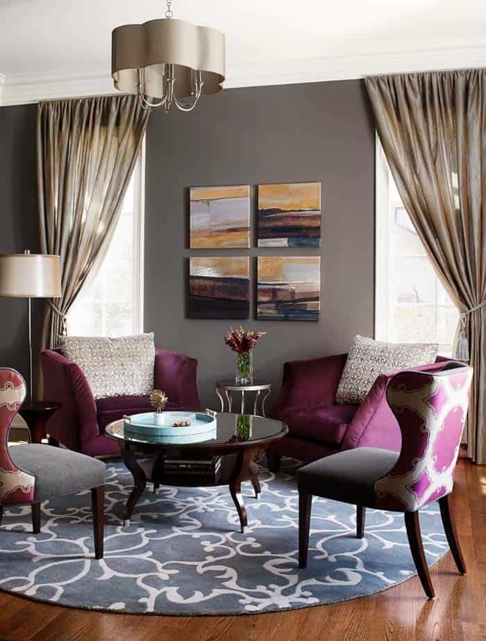
Purple

When it comes to adding a touch of sophistication to a room, few combinations can rival the elegance of purple curtains against gray walls. The rich, luxurious hue provides a subtle yet striking accent that seamlessly integrates into the space’s overall ambiance. This harmonious union is further enhanced by the lightweight texture of the curtain panels, which beautifully complement the organic elements and neutral tones found in this serene bedroom setting.
Red
In this inviting living room, the bold decision to incorporate red curtains is made possible by the harmonious connection it shares with the gray walls. The warm yellow undertones in the gray create a sense of continuity, which is echoed throughout the space through the fireplace, floor, and rug. This thoughtful design choice allows the red accents to thrive without feeling overwhelming or disjointed.
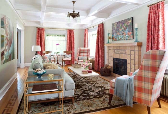
Striped
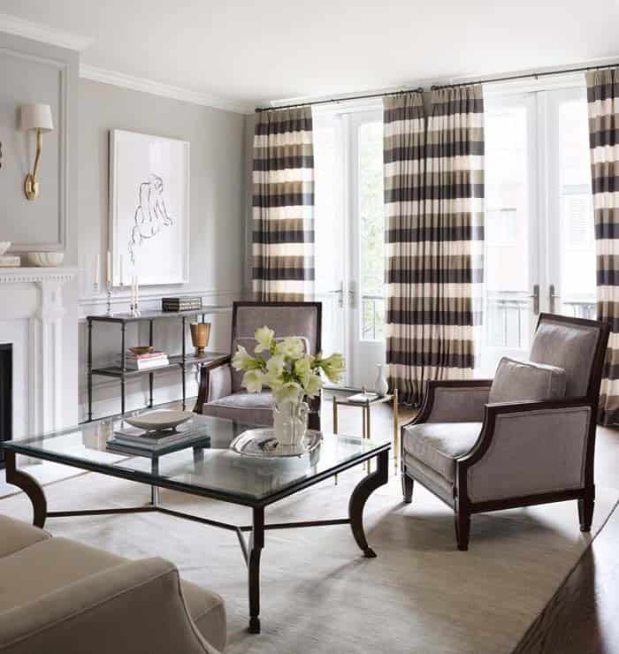
Imagine the striped panels as visual anchors that harmonize with the surrounding decor. The colors are seamlessly integrated into the chairs, couch, rug, and fireplace, creating a cohesive atmosphere. The subtle texture of the stripes adds depth and visual interest to the space.
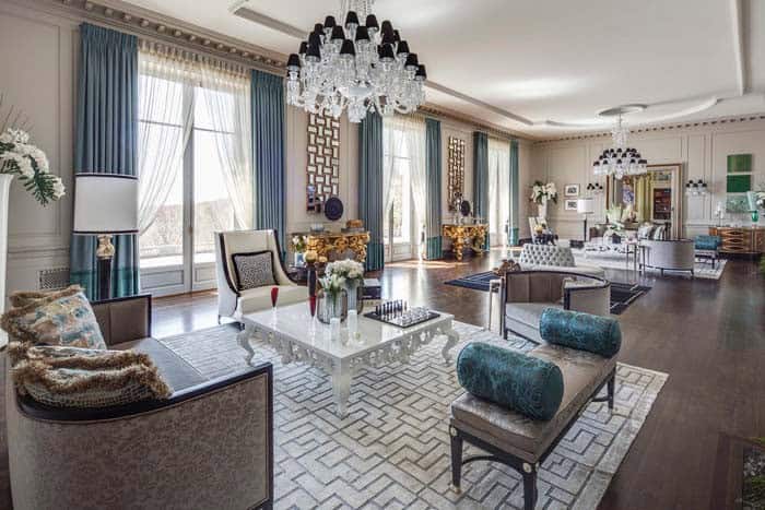
Teal
When it comes to selecting curtains for a gray wall color scheme, teal emerges as a top contender due to its harmonious relationship with gray. Its light blue hue not only complements the neutral tone but also injects a sense of freshness and modernity into the space. Lighter shades of teal can create a calming, coastal atmosphere, while darker tones can add depth and visual interest.
Teal curtains have the ability to brighten up a room without overwhelming it, ultimately achieving a balance between brightness and coziness. For those struggling to decide on a curtain color that complements gray walls, teal is a reliable and versatile choice that can also serve as an accent color in a room featuring both gray and brown hues. In this context, the dark walnut furnishings are perfectly balanced by the teal curtain panels, creating a harmonious visual effect.
Turquoise
In this harmonious gray and brown room, the turquoise accent color serves as a rich jewel tone. Its deep intensity grounds the space, allowing reflective surfaces to subtly cast light without overwhelming the senses. This thoughtful balance creates an inviting atmosphere.