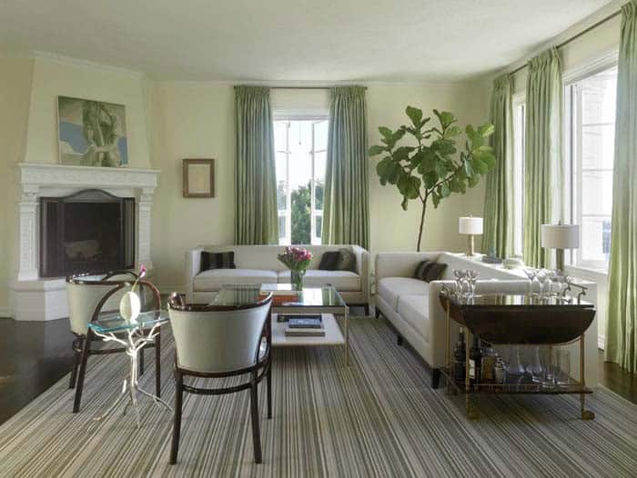
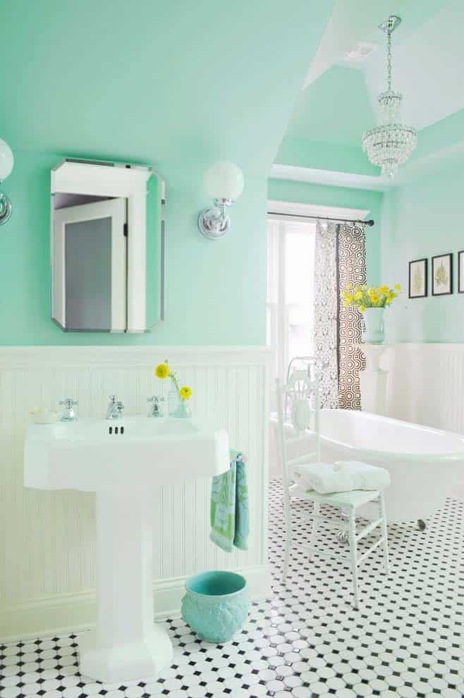
The ubiquitous nature of the color mint is undeniable, with its calming effect and versatility making it a popular choice for both fashion and interior design. When selecting complementary colors to pair with mint green in every room, certain hues stand out for their harmonious relationship. For inspiration, look no further than the current color trend, where mint green outfits are flooding store shelves.
In terms of pairing mint green pants with other colors, pastel shades of pink, blue, and purple prove to be a winning combination. But what about translating this color palette from fashion to interior design? Let’s explore. Mint green is, by definition, a light green color that exudes freshness and serenity. Its calming properties make it an ideal choice for creating a peaceful atmosphere in any room.
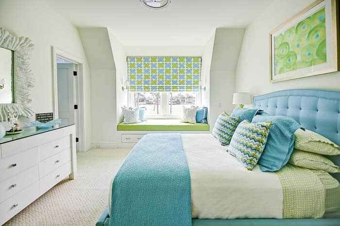
When combining mint green with other colors, options range from soft pastels to neutral tones, as well as the creation of contrast through darker shades and patterns.
Best Colors That Go With Mint Green
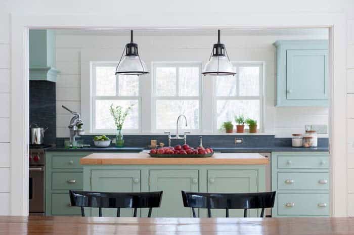
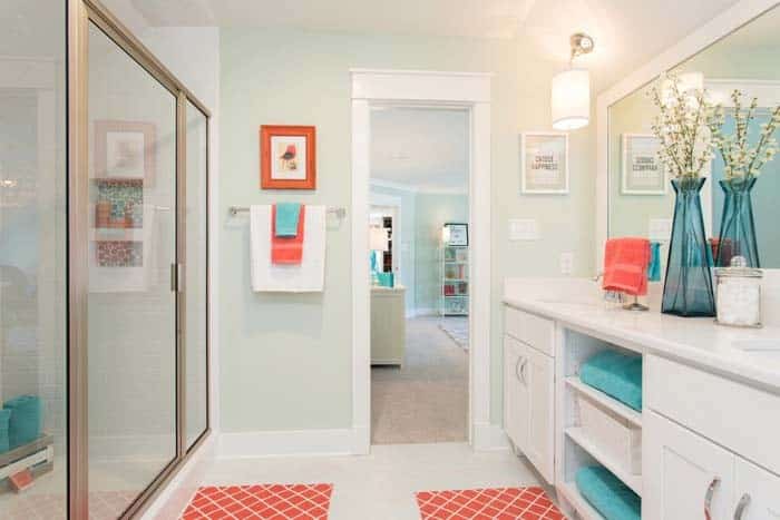
Teal and Mint Green
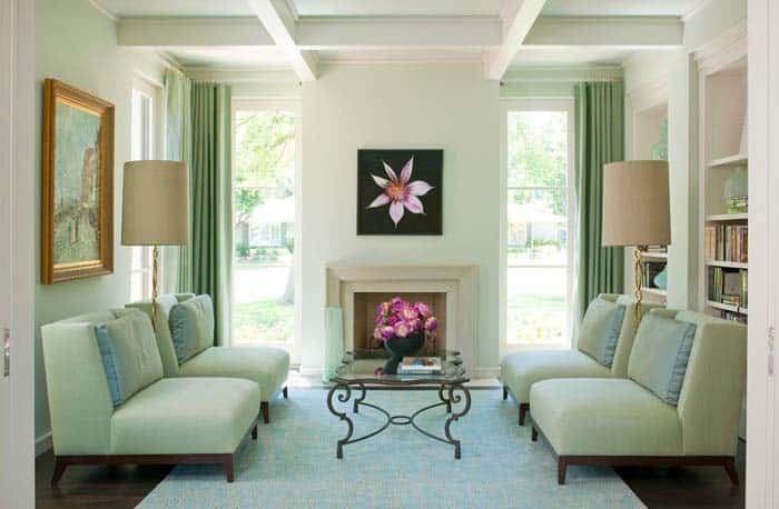
The harmonious union of mint green and teal is a seasonal phenomenon that yields a unique visual experience. As the seasons transition from spring and summer to autumn and winter, one color takes center stage while the other recedes into the background. In the warmer months, the soft mint hue dominates, only to be replaced by the calming teal tone as the temperature drops.
This classic combination, when presented in a lighter, softer shade, imbues a living room with a carefree, retro charm reminiscent of days gone by.
Jade Green and Mint Green
The mint green paint colour’s subtle tone is tempered by the richness of jade, resulting in a serene atmosphere that contrasts with the bright, energetic vibe that yellow would bring to the space. The harmonious combination of these colours serves as a natural backdrop for brown and beige furnishings, creating a sense of cohesion and calm.
Cream and Mint Green
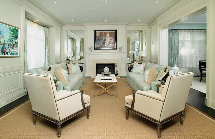
In this captivating living room, the bold choice to incorporate minty hues is on full display. The soft, calming tone effectively balances the dark hardwood floor, while the beige with yellow undertones injects a warm and inviting ambiance into the space. Notably, the creamy color scheme dominates in the chairs, coffee table, and fireplace surround, creating a harmonious visual flow that draws the eye.
Cherry Wood and Mint Green
Pairing a deeper shade of mint with cherry wood creates a nostalgic retro kitchen atmosphere that exudes warmth and character. One of the standout features is the way the cabinet doors showcase the rich wood finish. To replicate this look, consider using exterior wood stains to enhance the natural beauty of the wood. A design element that adds visual interest is the floor tiles, which were strategically set at an angle – a classic move that’s both stylish and timeless.
Navy Blue and Mint Green
In harmonious synergy, navy blue and mint green unite through the subtle blue undertones of the latter. This farmhouse kitchen’s masterful blend yields a soothing ambiance that embodies relaxed charm. The shiplap backsplash, an additional thoughtful touch, effectively evokes a retro farm kitchen aesthetic.
Gray and Mint Green
Infuse your kitchen with a fresh and vibrant atmosphere by combining the earthy tones of battleship gray with the calming essence of mint green. This harmonious blend allows for a striking visual contrast, where the boldness of the gray cabinets and black brick backsplash is balanced by the softness of the mint green interior paint, creating a cohesive look that’s both modern and inviting.
Brown and Mint Green
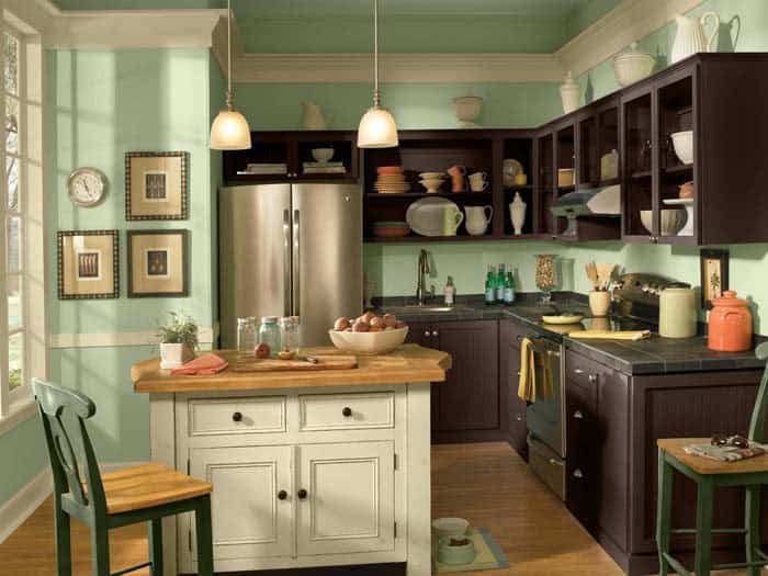
In this captivating retro kitchen, the deep, rich brown open cabinets appear to have been around for decades, their rustic charm enhanced by a striking contrast with the mint green walls. The judicious use of cream-colored trim and pops of vibrant orange adds a delightful burst of color, which is beautifully complemented by the light wood floors. This harmonious blend of hues and textures creates a unique space that is both nostalgic and modern.
Red and Mint Green
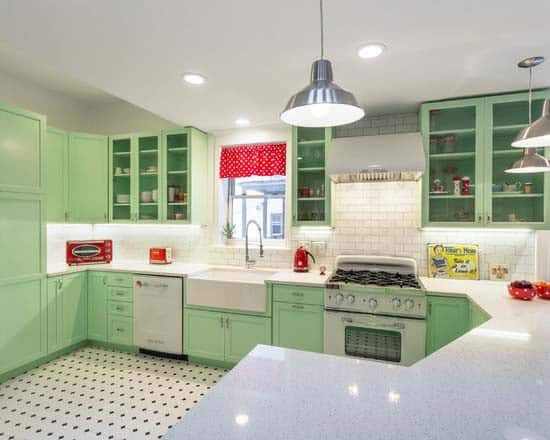
In this mint green kitchen, a small pop of red can create a significant visual impact. The introduction of red through window valances, toaster ovens, and other appliances offers the homeowner the flexibility to easily update the space by swapping out a few accessories. This retro-style kitchen is perfect for experimenting with an online color preview app. Simply take a photo of the room and test various accessory colors before making a purchase.
This approach not only saves money on paint supplies like trays and brushes, but also allows you to explore complementary colors. By doing so, you can create a unique and cohesive look without breaking the bank.
Emerald Green and Mint Green
When it comes to pairing greens with blue walls, you might assume that deeper shades wouldn’t be a good fit alongside mint green. However, emerald’s unique properties can actually enhance the yellow undertones in mint, creating a harmonious balance that brightens the space without disrupting its calming atmosphere. To successfully pair greens, explore color families and utilize resources like Benjamin Moore’s Affinity Colors.
This approach allows you to select a dark green and mint green paint that belong to the same family, resulting in a cohesive look. In this bedroom, for instance, the addition of cream tones through the rug, ceiling, linens, and accessories serves as a tempering influence, creating a soothing atmosphere.
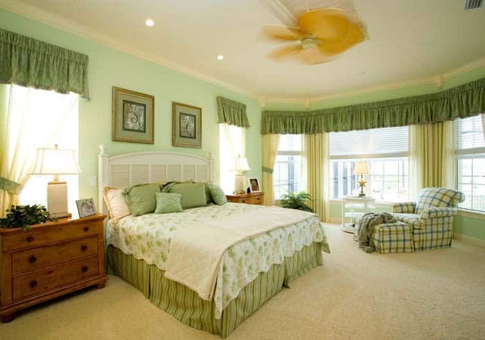
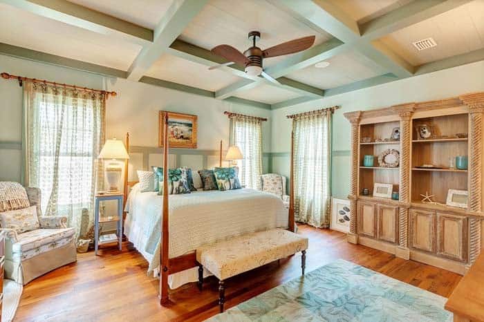
Beige and Mint Green
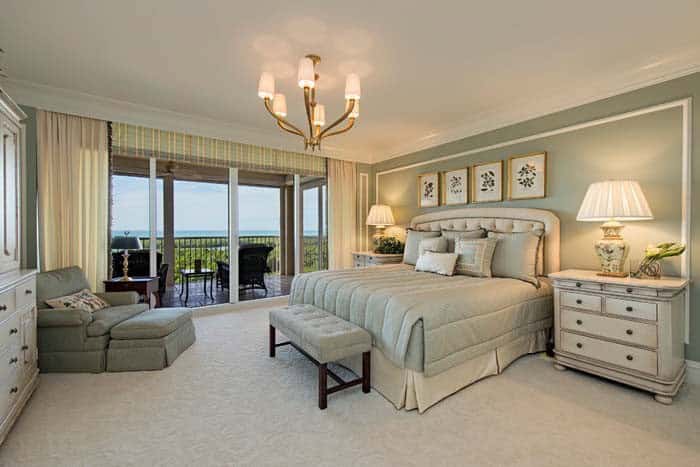
Building on our exploration of creamy off-whites and their harmonious pairing with mint, let’s turn our attention to beige. As we step into this primary suite, it’s clear how the beige hue subtly enhances the bluish undertones in the mint green walls and bed linens, creating a soothing atmosphere reminiscent of a coastal retreat bathed in natural sunlight.
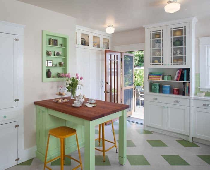
Yellow and Mint Green
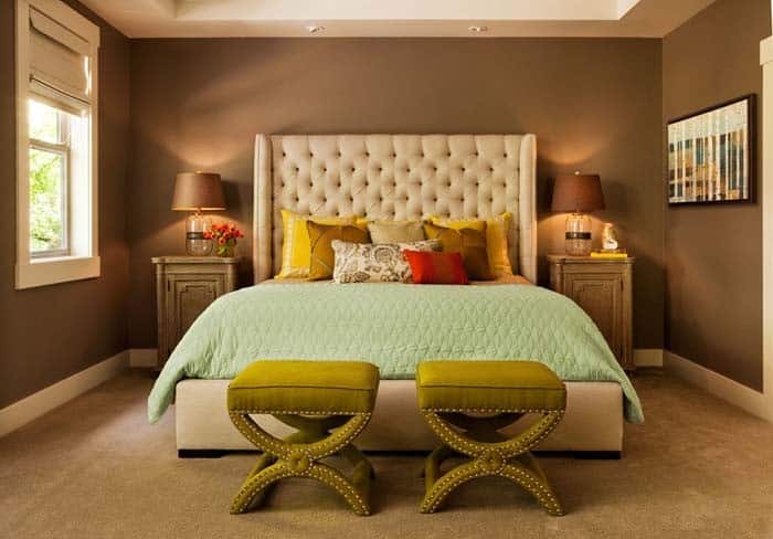
When seeking to inject a burst of vibrancy into your interior design, consider incorporating yellow accents that cleverly highlight the undertones in adjacent green hues. This thoughtful choice allows for a seamless transition between distinct elements, such as the bold red pillows and rich brown walls, while introducing a harmonious pop of color through the inclusion of yellow pillows.
The strategic use of this warm hue effectively bridges the gap between disparate design components, creating a visually appealing and cohesive aesthetic.
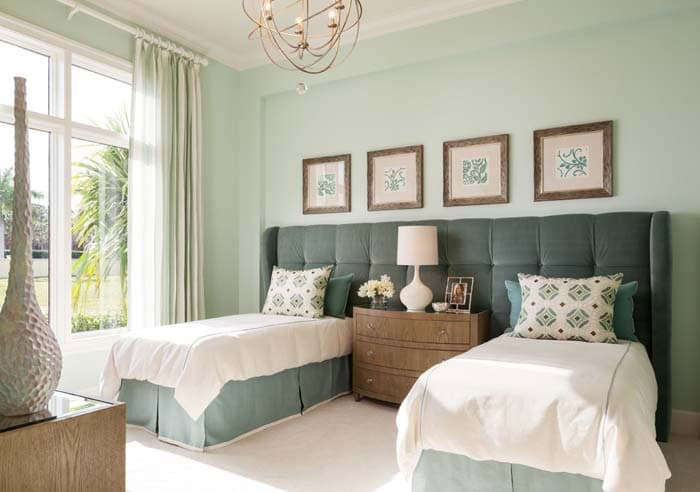
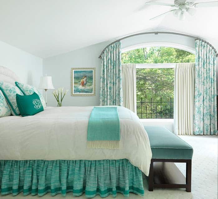
Light Blue and Mint Green
Incorporating light blue into an interior design scheme that features mint green accents can create a refreshing atmosphere. This harmonious combination is often found in coastal-inspired rooms, where sandy hues also come into play. When designing a bedroom, consider introducing a consistent visual thread by pairing these colors throughout the space. From the shades to the artwork on display, a cohesive look can be achieved when every element incorporates both light blue and mint green.
Blush Pink and Mint Green
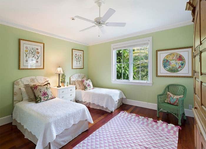
Infusing a room with pink can instantly introduce a touch of femininity. The addition of a charming fringed geometric rug imbues the space with youthful energy. Meanwhile, delicate pressed flowers, elegant floral prints, and soft embroidered white bed toppers bring a vintage allure, evoking a sense of nostalgia.
Olive and Mint Green
The harmonious union of olive and mint green is a striking example of how two distinct colors can coexist beautifully. The earthy undertones of olive, as seen in the window valances and art, subtly complement the natural yellow tones within the mint green. This color combination also pairs well with lighter shades of wood furniture, allowing the warm yellow hues to take center stage.
Orange and Mint Green
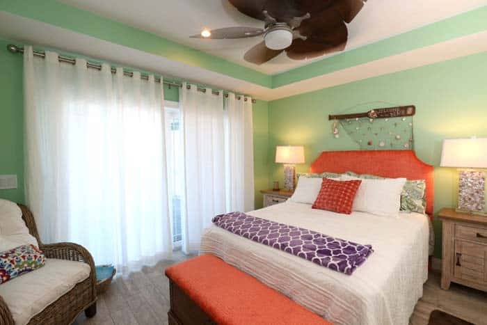
When it comes to creating a calming atmosphere, certain color combinations can make all the difference. Take, for instance, the pairing of rusty orange and mint green hues. This unexpected duo brings out the unique texture in white bedding, instantly injecting a sense of serenity into the space. The bold yet timeless quality of this color combination is what makes it so enduringly popular.
Light Gray and Mint Green
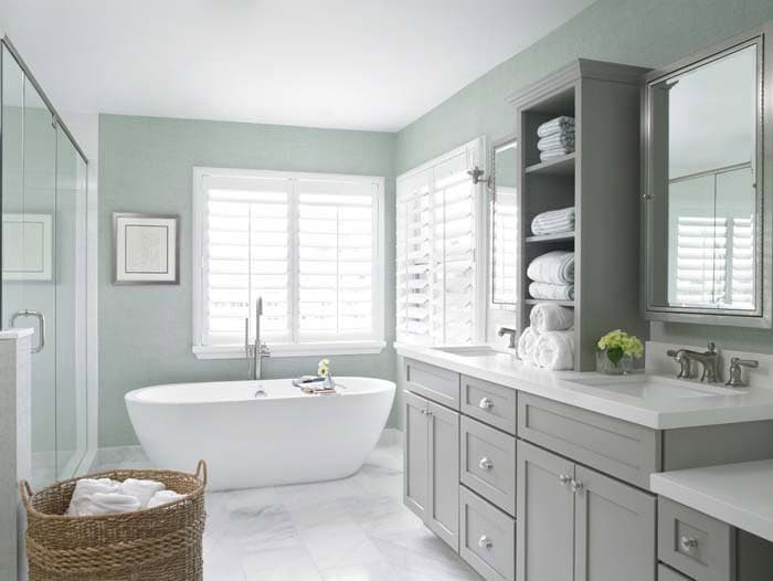
A calming ambiance pervades this bathroom, courtesy of the soothing palette that features soft gray, light gray, and mint green hues. The harmonious blend of these colors, combined with the crisp white tile floor, tub, and quartz countertops, creates a bright and refreshing atmosphere.
Turquoise and Mint Green
In this bathroom, a harmonious blend of turquoise and rusty orange evokes a refreshing energy. This unique combination thrives in settings inspired by Southwestern or Mediterranean design aesthetics. Conversely, mint green serves as a soothing base note, preventing any potential visual conflicts with the white cabinets.
Black and Mint Green
When paired with a vibrant mint green wall, black can feel somewhat jarring. To strike the right balance, it’s essential to use this dramatic color sparingly. In this design, we see black used thoughtfully in small tiles and picture frames, adding depth without overpowering the overall aesthetic. This vintage-inspired bathroom is a great example of how subtle restraint can lead to a harmonious visual experience.
Aqua and Mint Green
The harmonious union of these elements creates a sense of serenity, characterized by its gentle, weightless quality. Observe how it skillfully highlights the intricate details and rich tones of the granite countertop, as seen in this stunning example from Kitchen Studio: Kansas City.
Marble and Mint Green
When selecting a marble veining color, it’s crucial to consider its harmony with your countertops. A calming and organic option like mint can create a soothing atmosphere when paired with darker countertop hues, such as black. This combination is beautifully illustrated in the photo by Crisp Architects, where the soft yellow walls provide a lovely contrast to the subtle veining pattern.
White and Mint Green
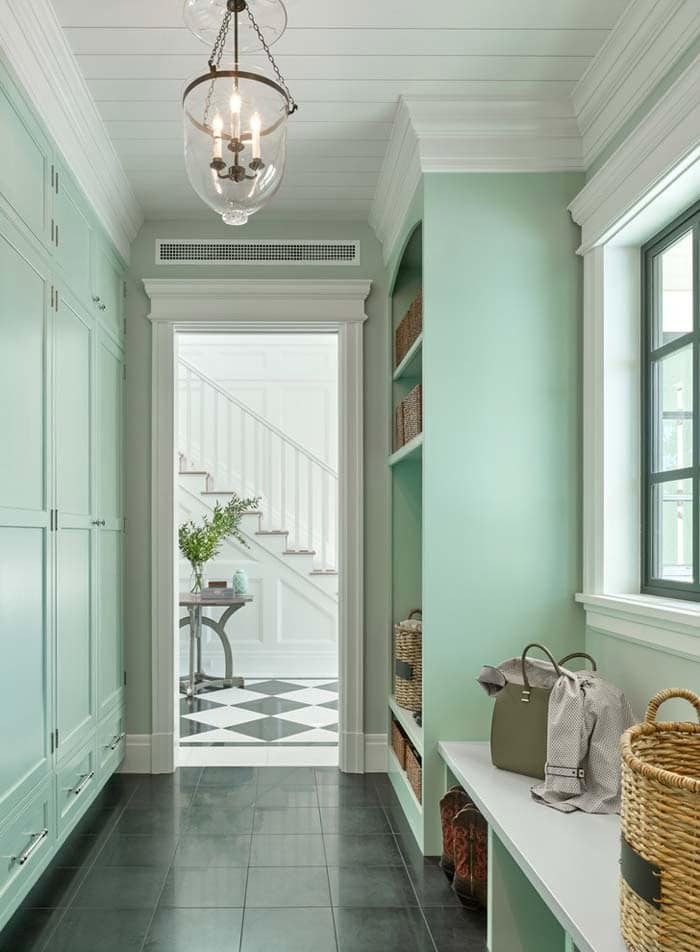
In this charming mint green mudroom laundry area, the crisp white trim and bench create a refreshing atmosphere in an otherwise small space. The subtle contrast provided by the soft charcoal gray floor tiles adds depth and visual interest. Interestingly, it’s not hard to see why white is the most frequently paired neutral color with mint – the combination is both timeless and versatile.
For inspiration, simply review any white-themed collection or explore popular whites to determine which shade will best complement your room.
Light Wood and Mint Green
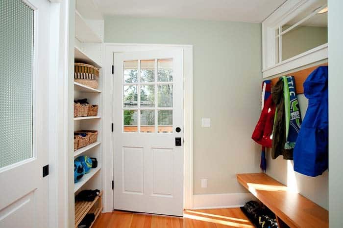
The farmhouse-inspired coat room exudes a warm and airy ambiance, courtesy of the wooden bench and hardwood floors. The rustic charm is further enhanced by the use of woven baskets to store gloves and hats, adding a touch of natural elegance to the space.
Dark Wood and Mint Green
For a touch of sophistication, dark wood complements mint green walls beautifully. To infuse authenticity into your space, collaborate with an experienced interior designer who is well-versed in historical colors and their corresponding nuances. They can guide you in selecting specialized paints and wood stains that evoke a sense of nostalgia, allowing you to create a period-inspired atmosphere.
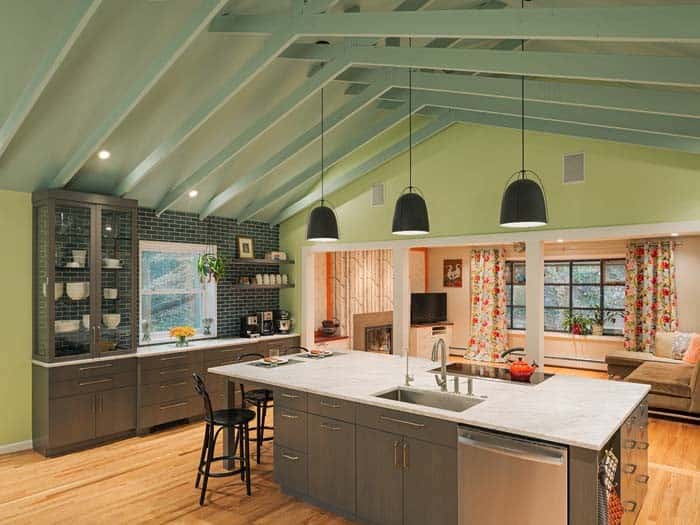
Taupe and Mint Green
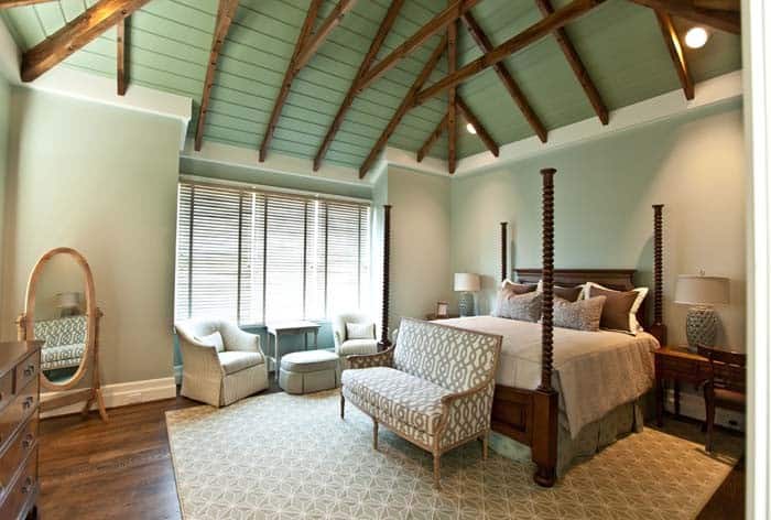
Taupe’s adaptability shines as the foundation for this palette of earthy tones, with its warm neutrals and rich browns providing a cozy backdrop. Meanwhile, the mint green on the vaulted ceiling effortlessly evokes a whimsical, forest-inspired ambiance, making it an excellent choice for a rustic lodge-style abode.
Celeste and Mint Green
Celeste’s delicate hue brings an airy, ethereal ambiance to the room, making it perfect for creating a serene and calming atmosphere. This soothing shade is ideal for bathrooms, where it can enhance a spa-like experience, or in bedrooms, where it can help promote relaxation and unwind at night.
Red Cedar and Mint Green
Incorporating red cedar into your design provides a timeless contrast to the vibrant hues of green and yellow. This classic wood serves as the primary color element, while the undertones in both green and yellow work harmoniously together, creating a cohesive pairing that benefits from its presence. The understated yet striking nature of red cedar makes it an ideal choice for balancing bold and bright colors, allowing them to shine while still maintaining visual equilibrium.