In your home, the living room may be where guests spend most of their time, but the bedroom is a sanctuary that deserves just as much attention. It’s your personal oasis within the walls of your house or apartment, and it should evoke a sense of belonging and comfort. The colors you choose for your bedroom can play a significant role in creating this feeling, which is why we’ve included popular SW paint color names to help inspire your design decisions.
Please note that our interpretations are subjective and may not perfectly replicate the actual paint colors, as different shades and nuances can occur. For added convenience, we recommend checking out our free cost estimator tool HERE to get an idea of how much it will cost to paint a room in your area. With that said, here are 20 beautiful bedroom color schemes for you to consider.
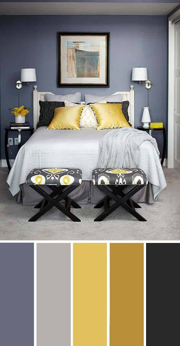
Yellow, Gray and Navy Blue
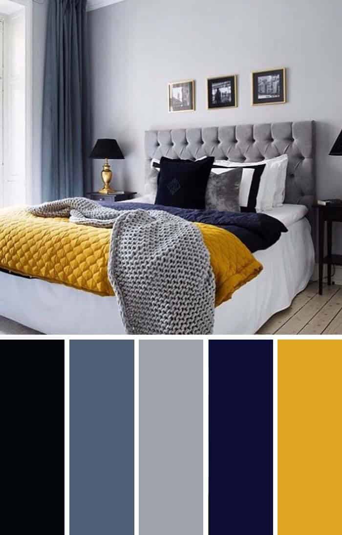
A bold and stylish color palette exudes confidence and personality. This palette is perfectly suited to a queen-sized bed, which serves as the focal point of the room. The golden-yellow blanket adds a touch of splendor, transforming the otherwise subdued bedroom into a vibrant statement piece that reflects the homeowner’s sense of class. To further illustrate this design concept, the following color chart provides a visual representation of the palette.
SW 6258 Tricorn Black
SW 6537 Luxe Blue
SW 7073 Network Gray
SW 6818 Valiant Violet
SW 6691 Glitzy Gold
Pastel Colored Bedroom
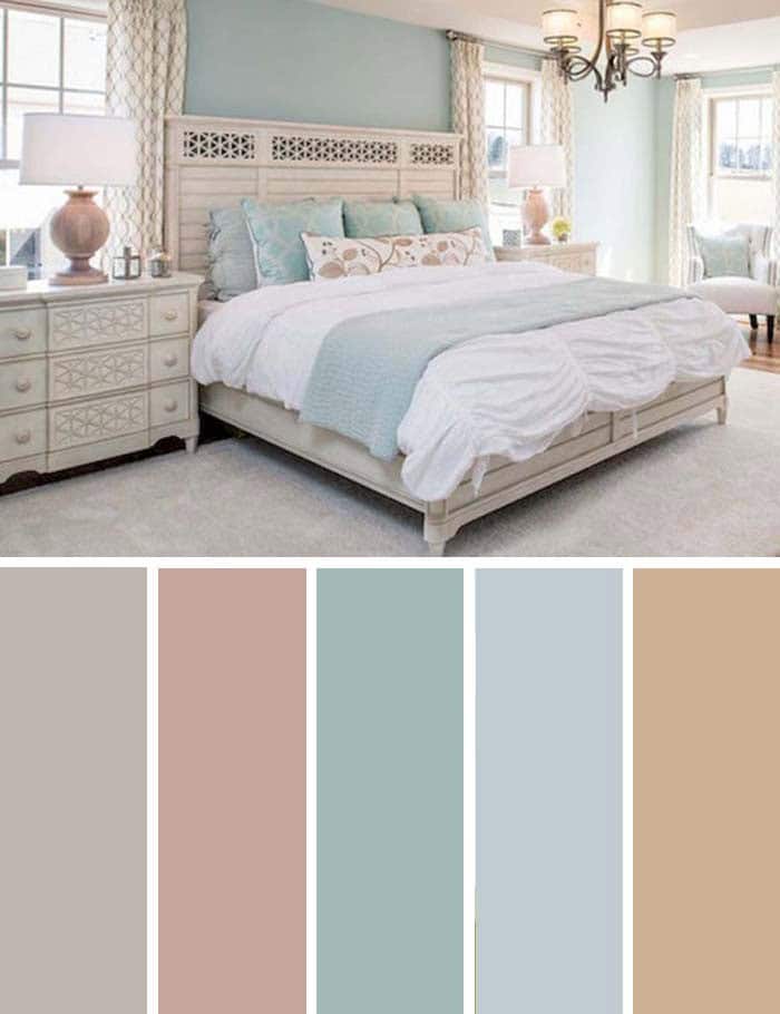
When it comes to designing your bedroom, it’s essential to create a space that reflects your personality and promotes relaxation. As the most personal room in your home, you should prioritize creating an atmosphere that makes you feel good. One effective way to achieve this is by incorporating calming paint colors that soothe your senses. Pastel tones can be particularly effective at easing eye strain and inducing feelings of happiness and comfort.
For a bedroom that embodies serenity, consider using colors like Anew Gray (SW 7030), Beige Intenso (SW 9096), Languid Blue (SW 6226), Sleepy Blue (SW 6225), or Tawny Tan (SW 7713) for a tranquil retreat.
Beige and Black
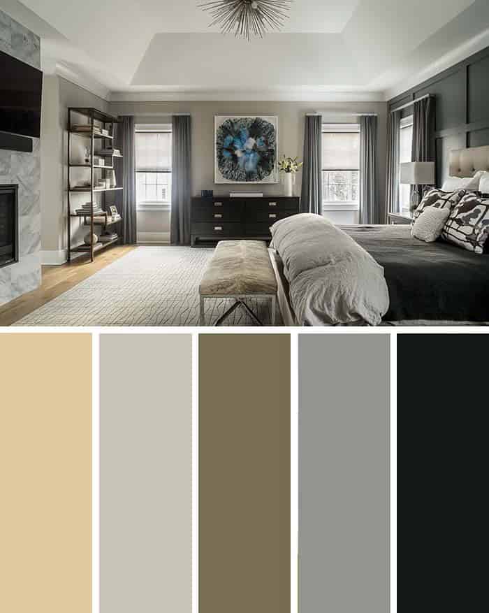
When it comes to creating a harmonious interior design scheme, many people overlook the versatility of beige as a primary color choice. In reality, beige is an excellent solution that effortlessly blends with a wide range of colors, including grayscale hues without overpowering them. Furthermore, it brings a sense of warmth and coziness to any space.
The Sherwin-Williams color chart offers a variety of options, including Straw Harvest (SW 7698), Fortitude (SW 9562), Twig Basket (SW 9529), Tin Lizzie (SW 9163), and Night Watch (SW 9680), providing endless possibilities for those looking to incorporate beige into their design.
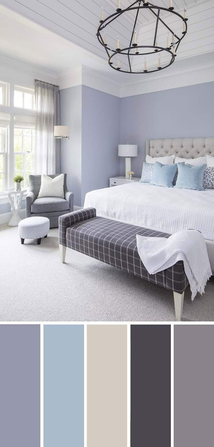
Plum, Silver, Lavender
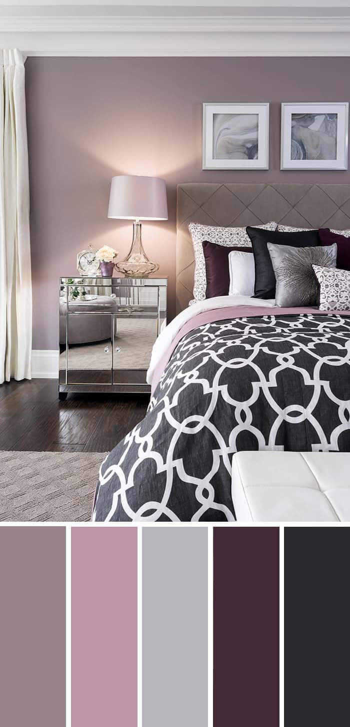
Purple, a bold and demanding color, also embodies the essence of life, spring, and nature. Its various shades offer a unique opportunity to incorporate this vibrant hue into your interior design. In this space, lavender takes a subtle approach, but hints of purple can be found throughout the room’s design elements.
The Sherwin-Williams color palette provides a starting point for inspiration, with options like Ruby Violet (SW 9076), Rosé (SW 6290), Colonial Revival Gray (SW 2832), Blackberry (SW 7577), and Domino (SW 6989) offering a range of possibilities.
Turquoise and White
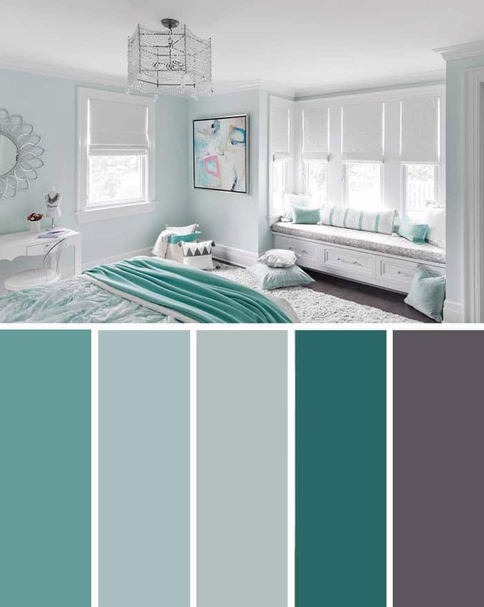
In this room, the turquoise palette masterfully balances a clinical cleanliness with a distinct sense of style. The color permeates every aspect of the space, from the bed sheets and pillows to the walls and artwork. While there are various shades present, the boldest hue serves as a striking accent. This nuanced combination of colors is reminiscent of a carefully crafted work of art.
Navy Blue, Gold & Black
The harmonious combination of yellow, navy blue, and black creates a visually appealing atmosphere in this room. The richly saturated navy walls provide the backdrop for pops of white and gold, which add a sense of warmth and invitation.
The carefully curated color palette is further enhanced by the addition of specific shades, including Gibraltar’s deep blues (SW 6257), Allegory’s subtle nuances (SW 9553), Frolic’s playful touches (SW 6703), Different Gold’s sunny disposition (SW 6396), and Tricorn Black’s sophisticated neutrality (SW 6258).
Navy Blue Accent
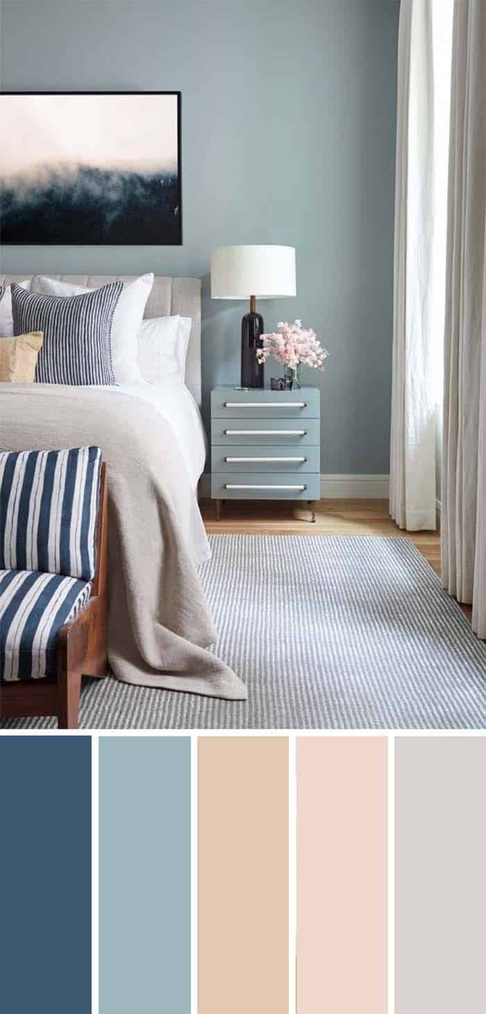
While navy blue makes a stunning background color, its applications in modern bedrooms extend far beyond that. For those who crave brighter spaces that reflect sunlight rather than absorb it, there’s still a way to incorporate this versatile hue. The contrast between the soft blue walls and navy blue accents creates a striking visual effect, making it an ideal choice for adding depth and dimension to the room.
This color combination is reminiscent of the palette found in the SW Color chart, which features a range of blues, including Indigo Batik (SW 7602), Faded Flaxflower (SW 9146), Townhouse Tan (SW 7712), Alyssum (SW 6589), and Crushed Ice (SW 7647).
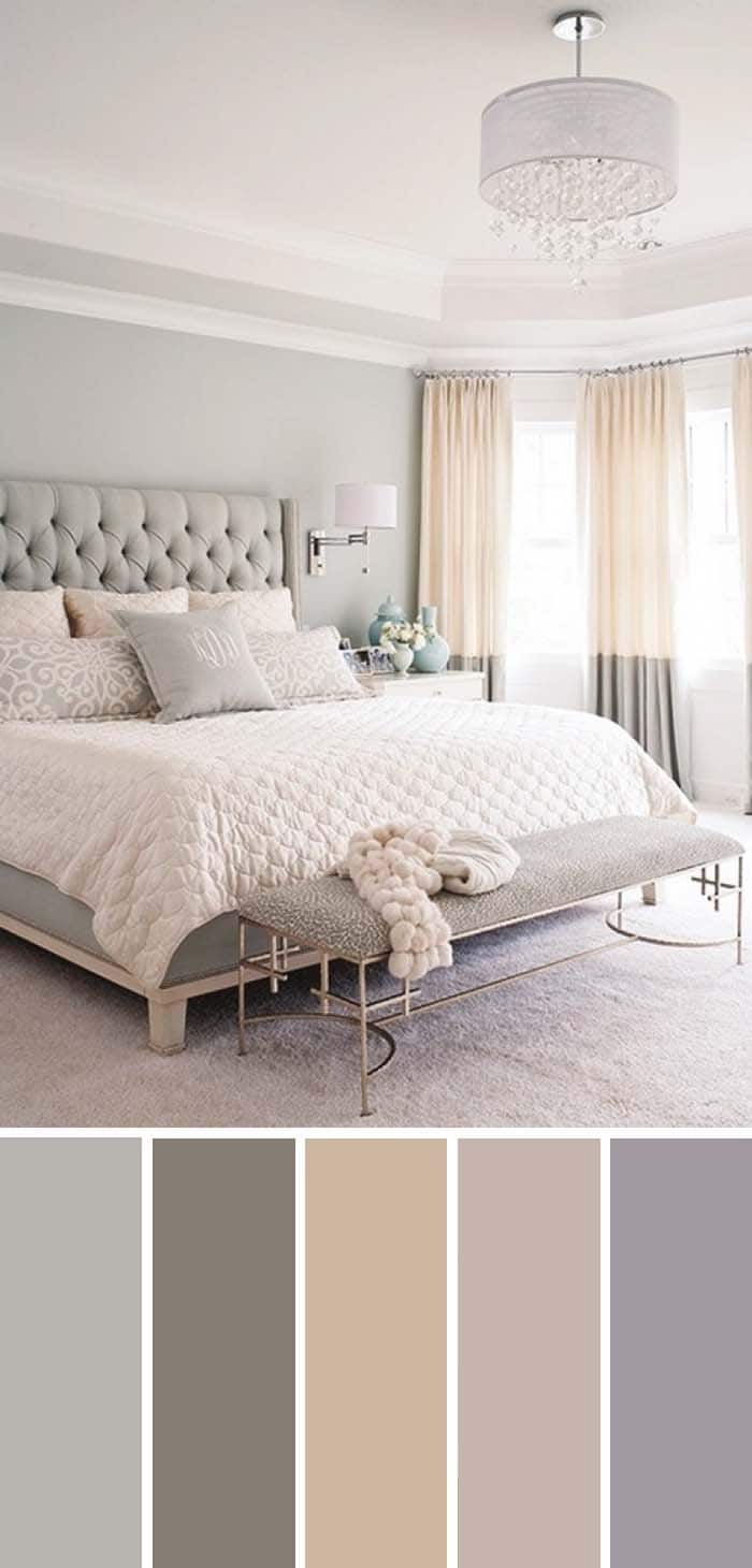
Cream Bedroom
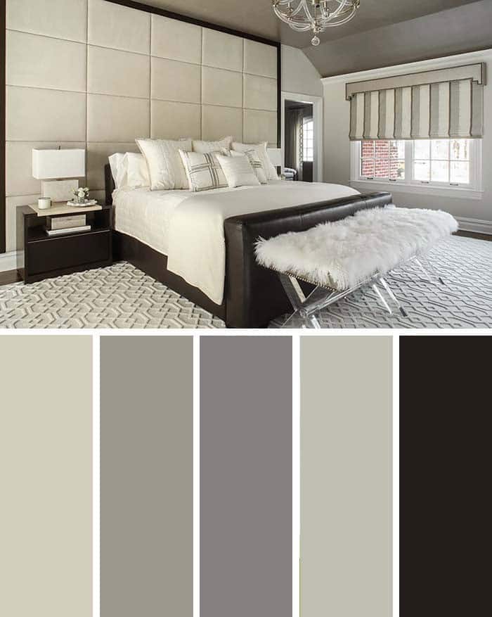
A serene atmosphere can be achieved without relying on a plethora of colors. This bedroom exemplifies this notion, showcasing how grayscale hues can create a cozy ambiance when properly balanced. The pièce de résistance is the oversized king-sized bed, which sits majestically amidst a tapestry of rich grays and cream tones that work in harmony to evoke a sense of tranquility.
According to Sherwin-Williams’ color chart, the palette draws inspiration from hues such as Accolade (SW 9516), Pewter Cast (SW 7673), Going Grey (SW 9554), Austere Gray (SW 6184), and Black Bean (SW 6006).
Purple and Lilac
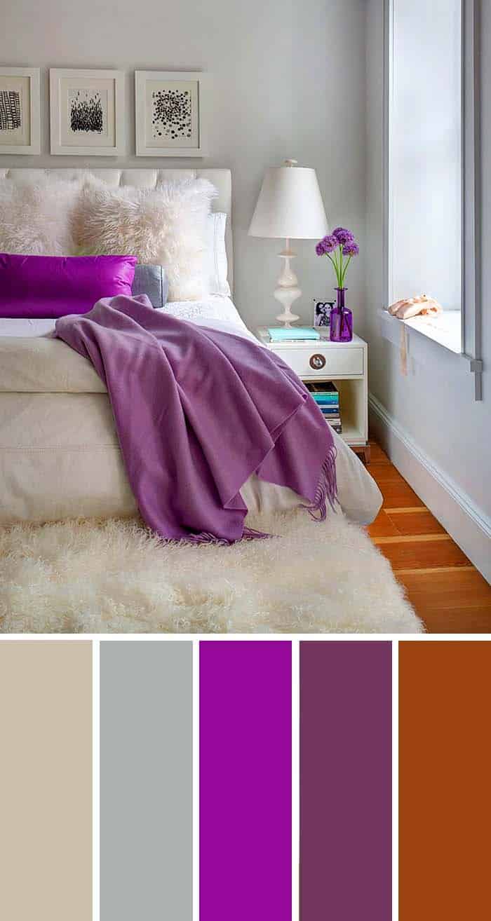
The striking nuances of purple as accent colors bring a revitalizing energy to the space, transforming what was once a plain and comfortingly white room. The bed cover and pillow in harmonious shades of purple and lilac inject a sense of vitality, while the subtle walls and beautiful floor further enhance the ambiance.
Notably, the soothing tones of SW 7542 Naturel, SW 7652 Mineral Deposit, and others (including the vibrant Forward Fuchsia, Fabulous Grape, and Hearty Orange) create a captivating visual narrative.
Earthly Tones
Complementing understated color schemes can be achieved by incorporating earthly tones, such as brown, soft orange, and beige. This approach was employed here to subtly energize the white and gray elements found in the headboard and floor. By doing so, the overall aesthetic is revitalized without overpowering the existing design.
The selected palette includes shades like SW 6198 Sensible Hue, SW 7053 Adaptive Shade, SW 6142 Macadamia, SW 9086 Cool Beige, and SW 6549 Ash Violet, which collectively contribute to a harmonious balance.
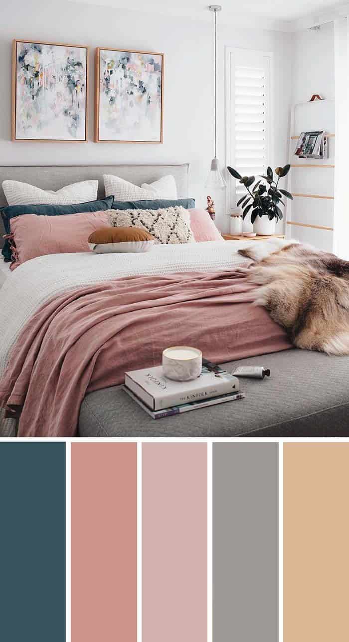
Dark Teal And Dusty Rose
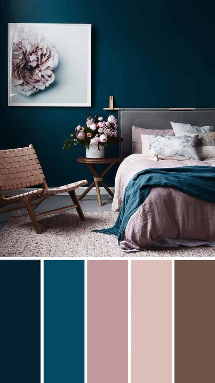
When contrasting colors are done well, they can be truly stunning. However, it’s easy to go wrong and end up with a look that’s more kitsch than chic. The key is to find a balance between seemingly opposing hues. For example, the rich blue of the wall (SW 6966 Blueblood or SW 6510 Loyal Blue) pairs beautifully with the softer shade of dusty rose in the chair, rug, and bed (SW 6563 Rosebay or SW 6583 In the Pink).
The teal adds a pop of intensity, but the rose tones provide a calming counterpoint. By combining these colors, you can create a harmonious and inviting space that’s far from kitsch.
Gray and Orange
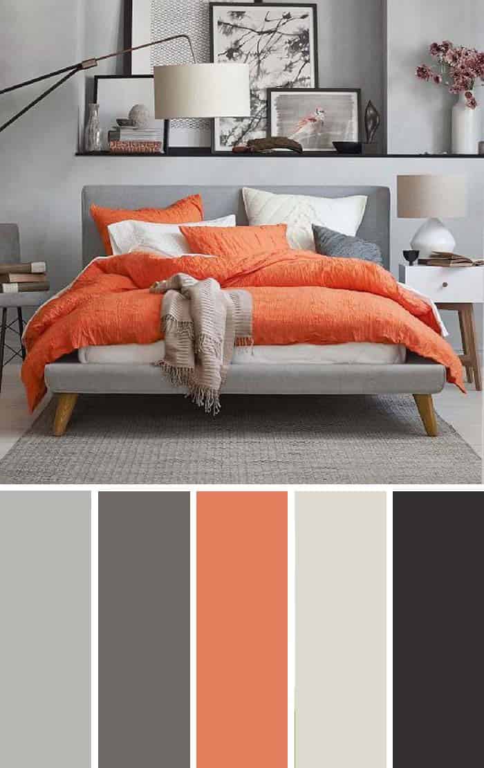
A show-stopping bed is the perfect anchor for a bedroom, and this striking combination of neutral gray and bold colors proves it. As the room’s central focal point, it injects a sense of energy and dynamism into the space. To avoid overwhelming the senses, small pops of color are strategically scattered around the bed, ensuring it remains the room’s crowning glory.
This harmonious blend is made possible by a thoughtful palette that includes hues like March Wind (SW 7668), Storm Warning (SW 9555), Rejuvenate (SW 6620), City Loft (SW 7631), and Deep Forest Brown (SW 9175).
Coastal Blue
Blending the essence of a sunny day by the seashore into your home’s interior design can be a challenging task. While certain hues of blue and yellow, such as this stunning blue shade, can certainly contribute to the desired ambiance, it’s equally crucial to incorporate thoughtful design elements that facilitate a sense of openness and freedom.
This might include incorporating large windows that allow natural light to flood in, as well as ample space for owners to move about without feeling confined. In terms of specific color choices, designers may find inspiration in Sherwin-Williams’ palette, including options like Dustblu (SW 9161), Windy Blue (SW 6240), Symmetry (SW 9601), Quixotic Plum (SW 6265), and Classic French Gray (SW 0077).
Feminine Bedroom
While pink can be a quintessential girly color, creating a more mature and sophisticated feminine space requires some added depth. One way to achieve this is by incorporating neutral tones like gray to provide structure, and white to emphasize the other colors. Additionally, introducing blue as an accent can add a touch of elegance. When done thoughtfully, these elements come together to create a truly refined and inviting retreat that exudes class and femininity.
The perfect combination of colors could include hues like Seaworthy (SW 7620), Coral Island (SW 6332), Sashay Sand (SW 6051), Site White (SW 7070), and Moonlit Orchid (SW 9153).
Aqua & Lime
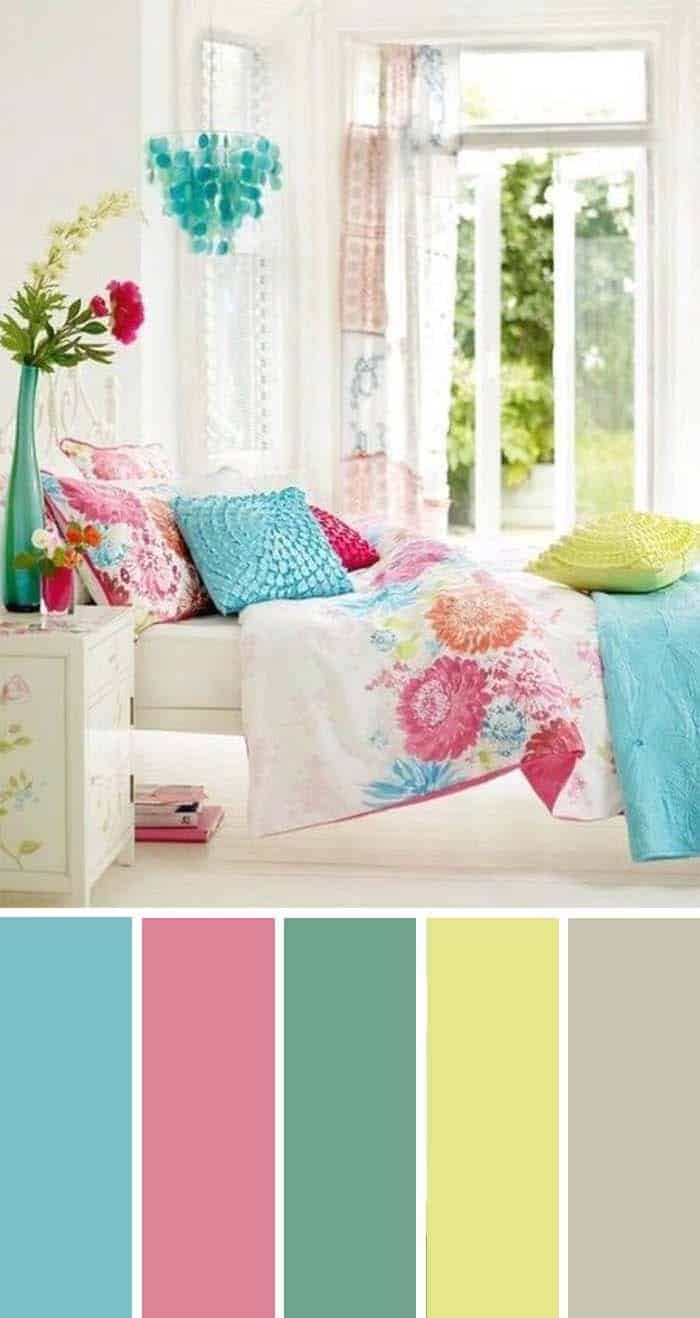
Some individuals crave a bedroom that’s not just a serene retreat, but an energizing space that radiates joy and positivity. A vibrant color palette is the perfect way to infuse this atmosphere, reflecting the owner’s creative personality. The right hues can instantly uplift the mood and create a sense of excitement.
To achieve this, consider incorporating a range of bright colors, such as Rapture Blue (SW 6773), Memorable Rose (SW 6311), Eco Green (SW 6739), Optimistic Yellow (SW 6900) and Cargo Pants (SW 7738).
Navy Blue Color Scheme
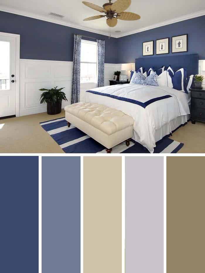
When it comes to bedroom colors, the traditional dichotomy of white and black is too limiting. Instead, incorporating a vibrant hue can greatly enhance the space’s ambiance. While many colors may be touted as ‘the new black’, our preference remains navy blue, the natural successor to this classic duo. The beige floor, white wainscoting, bed cover, and ceiling provide a subtle backdrop that allows the bold blue to truly shine.
For a comprehensive guide to exploring the various shades of blue, refer to Sherwin-Williams’ Color Chart, which features stunning options like Dignified (SW 6538), Soulful Blue (SW 6543), Threaded Loom (SW 9512), Fortitude (SW 9562), and Vintage (SW 9528).
Coral Painted Bedroom
If you’re drawn to earthly tones but worry they may be too dull, a pop of color is just what you need. One way to achieve this is by embracing the natural world and incorporating shades reminiscent of the ocean. Coral-painted rooms can have a mesmerizing effect, as if they’re alive. The softness of the pink hue also makes it an excellent choice for creating a calming atmosphere.
The Sherwin-Williams color chart offers a range of options to suit your taste.
For example, Cotton Candy (SW 9692) adds a playful touch, while Colony Buff (SW 7723) provides a warm, inviting feel. Youthful Coral (SW 6604) is perfect for those who want a room that feels like a beachy escape. Sockeye (SW 6619) brings a sense of energy and vitality, while Rookwood Terra Cotta (SW 2803) adds a touch of rustic charm. With these options, you’re sure to find the perfect shade to bring your vision to life.
Light Green
Nature’s serenity, life-giving vitality and a sense of tranquility are all embodied in the warm, soothing hue of green. This calming color has the power to effortlessly transport us to serene outdoor settings, where worries fade away amidst lush plant life. In this enchanting bedroom, the harmonious blend of colors evokes a strong desire to embark on a woodland adventure – after a rejuvenating nap, of course!
The accompanying color chart showcases six captivating shades: Koi Pond (#7727), Daffodil (#6901), Rural Green (#6418), Nankeen (#6397) and Malabar (#9110), each one an invitation to connect with the natural world.
Gray, Yellow and Black
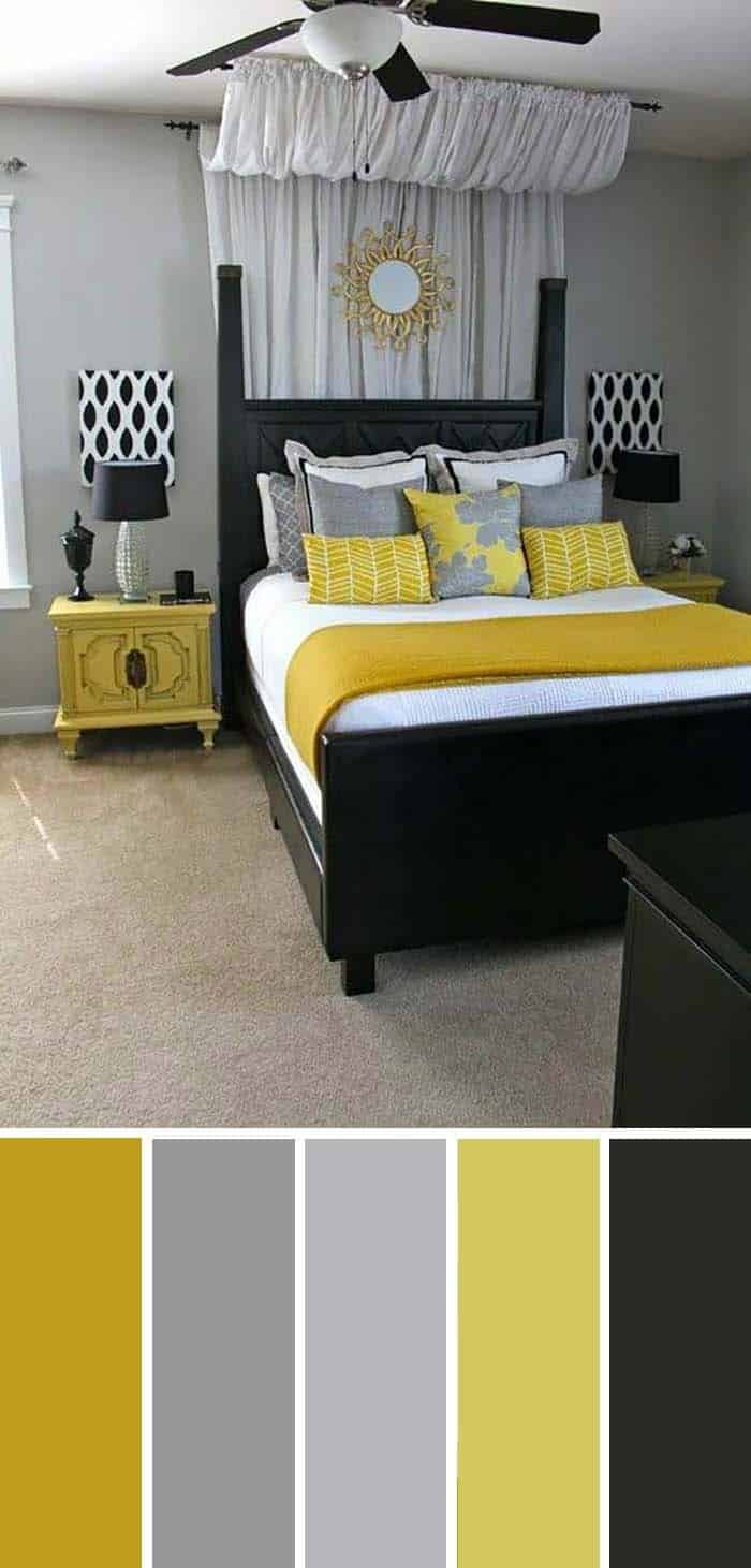
The classic combination of dark colors gets a lift from the bold accent of bright yellow. This courageous choice adds an air of confidence to the overall design, making it feel classy and elegant at the same time. The yellow also brings a sense of refreshment and excitement, perfectly balancing out the darker tones.
When paired with other colors like SW 6699 Crispy Gold, SW 9162 African Gray, SW 2832 Colonial Revival Gray, SW 6703 Frolic, or SW 6258 Tricorn Black, the yellow adds a pop of personality to the design.
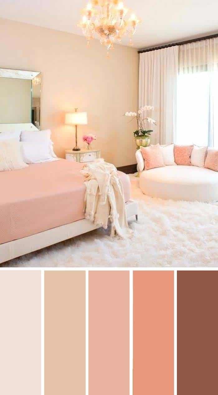
Taupe and Pale Pink
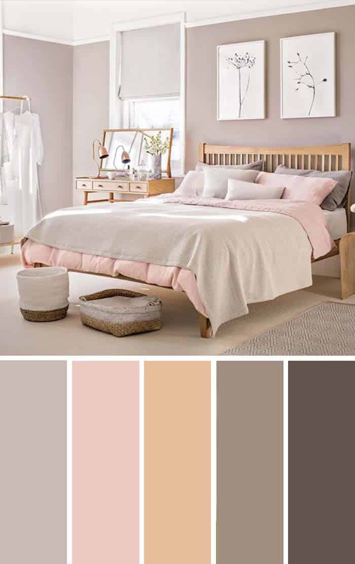
Taupe, a subtle shade of gray with hints of brown, pairs effortlessly with pale pink, a refined and understated version of the vibrant hue. This elegant combination is sure to elevate your bedroom’s aesthetic without overpowering its ambiance. While selecting colors for your sanctuary can be daunting, discovering these harmonious pairings transforms the process into an exciting adventure, allowing you to experiment with various shades and unleash your creativity.
For inspiration, consider the soothing palette of Sherwin-Williams: 9173 Shiitake, 6323 Romance, 6359 Sociable, 9084 Cocoa Whip, or 9604 Tea Leaf, each one a unique blend of colors that can be mixed and matched to create a look that’s all your own.
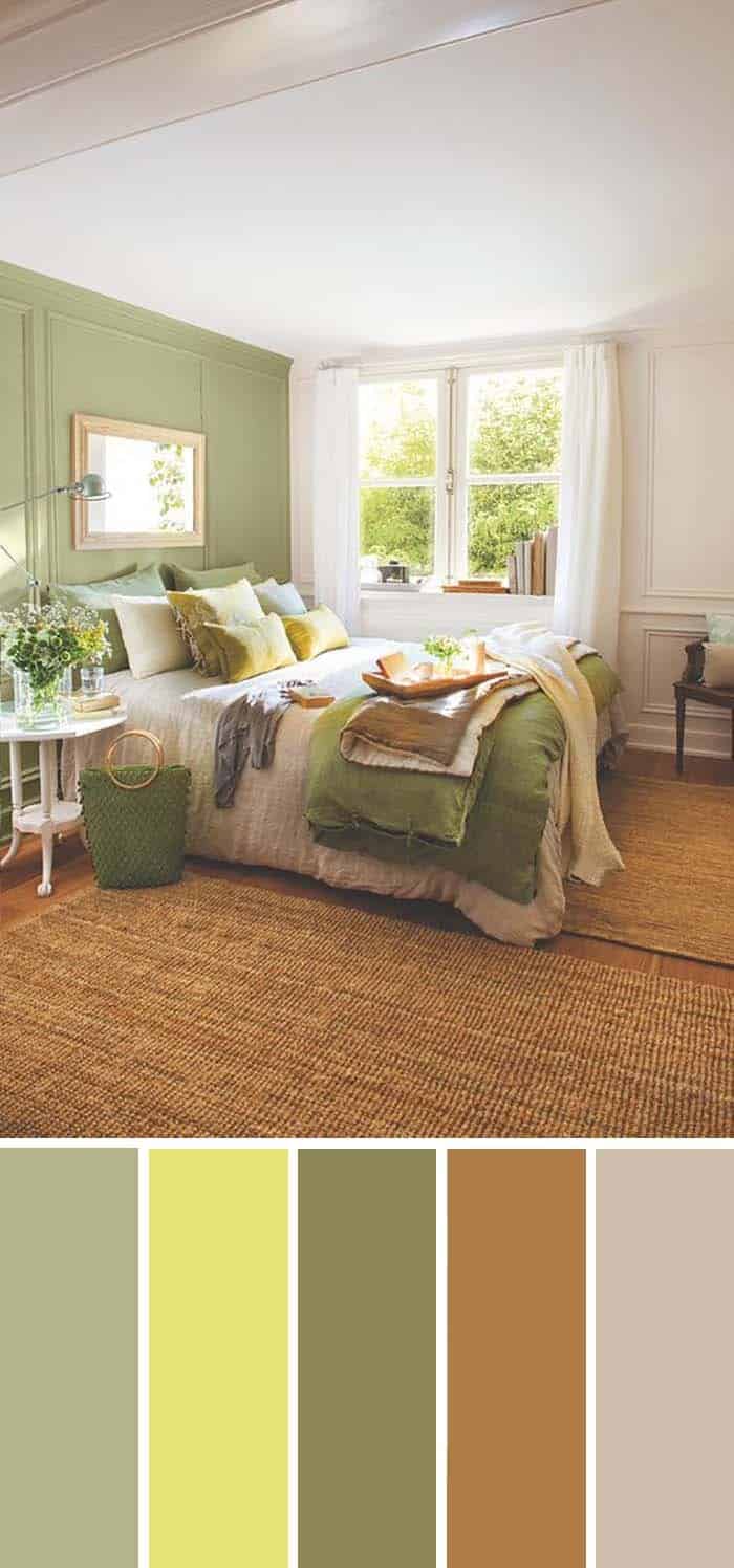
Earth Tone Green Bedroom
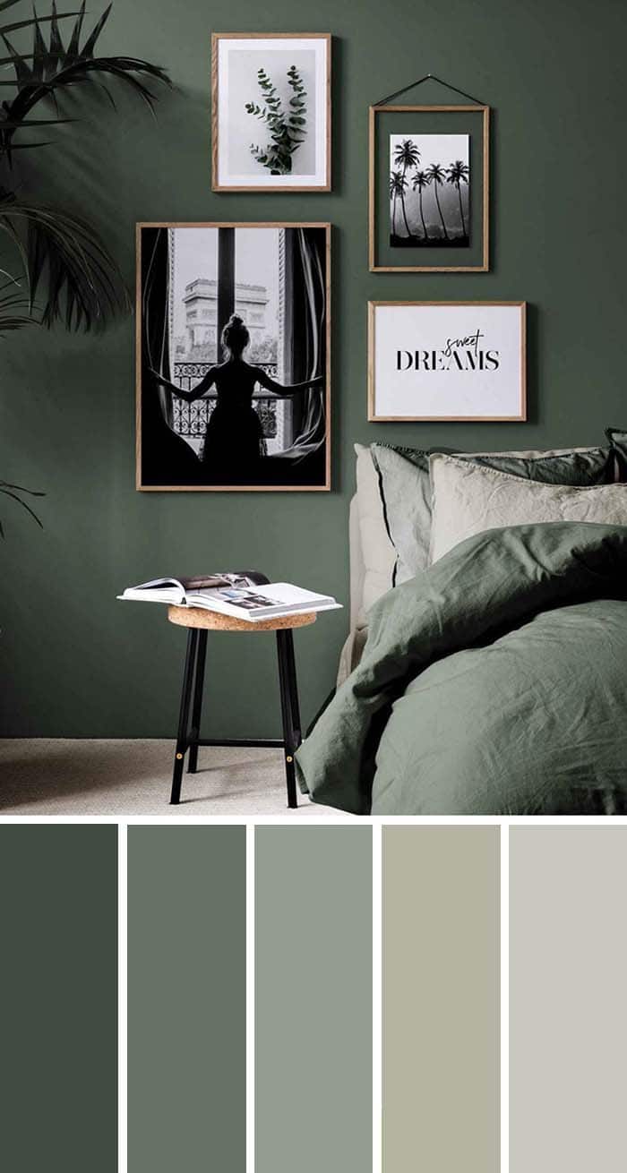
This bedroom color palette is a visual treat that effortlessly blends rich, ambient tones with calming neutral shades. The transition from deep green hues to soothing grey or beige notes creates a harmonious balance that can help soothe the senses. The specific colors featured include Olympic Range (SW 7750), Basil (SW 6194), Acacia Haze (SW 9132), Silver Gray (SW 0049), and Antimony (SW 9552).
It’s essential to note that these color references are intended for aesthetic purposes only, as the actual shades may vary depending on the device screen or other factors. The important thing is the overall harmony and calming effect they can bring to a bedroom space.