When seeking refuge from the stresses of everyday life, there’s no better haven than our own homes. To create a sanctuary that soothes both body and mind, it’s not just about comfortable seating or quiet ambiance – although those elements are certainly important. The key to crafting a truly calming space lies in its visual appeal, particularly when it comes to the colors used on your walls.
While bold, vibrant hues may seem appealing at first glance, they can actually have the opposite effect, exacerbating feelings of anxiety and nervousness. In contrast, carefully chosen calming paint color schemes can work wonders for reducing stress levels. With this in mind, we’ve curated a selection of 12 serene paint colors to help you create a peaceful retreat that reinvigorates both your body and spirit.
Create a Calming Atmosphere with Light Blue and Pale Green
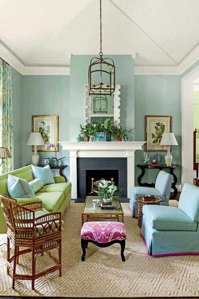
Imagine stepping into a tranquil oasis, where soothing hues of light blue and pale green harmonize in perfect balance. This serene living room exudes calmness, with the added pop of bold color on the ottoman serving as a delightful contrast that doesn’t disrupt the peaceful ambiance.
Transform Your Room into a Cozy Oasis with Beige
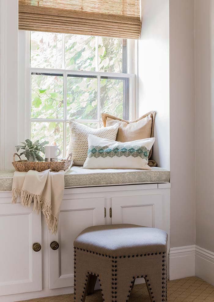
Beige, often perceived as a warm and inviting hue, harmoniously pairs with soft shades of brown to create a tranquil atmosphere. By incorporating neutrally toned pillows and furniture, you can craft the perfect retreat where you can unwind and relax throughout the day. Moreover, reading nooks can serve as a serene escape from the hustle and bustle of everyday life, providing a peaceful sanctuary for your mind and soul.
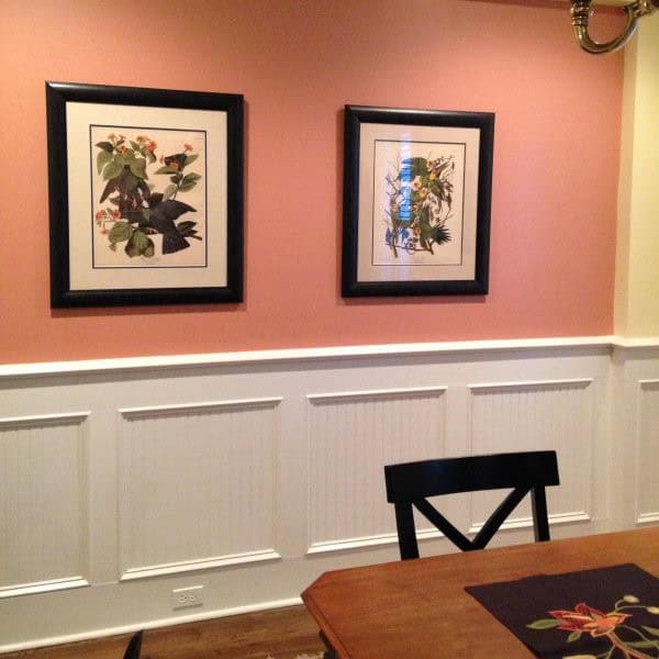
Elevate Your Home with Mauve
The calming effects of mauve are undeniable. This unique blend of gray and purple hues creates a soothing atmosphere that’s neither overpowering nor underwhelming. The result is a harmonious balance that makes it an ideal choice for spaces like the dining room or living room, where relaxation and warmth are key.
Be Bold with Deep Blue
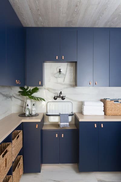
While some may perceive bright blues as overwhelming, selecting a more subdued hue can actually promote a sense of calm. Take, for instance, the example above, where a softer blue tone creates a serene atmosphere. Additionally, blue is one of this year’s most popular paint colors, offering an effortless way to incorporate a trendy touch into your walls or kitchen cabinets.
Make a statement with Coral and Contrasting Accents
For those who prefer softer hues, consider the vibrant yet subtle tone of coral paint color. This shade pairs beautifully with a range of cooler tones, adding depth and visual interest to your space. Additionally, it harmonizes perfectly with warm colors like orange, red, and yellow, creating a stunning contrast that adds personality to any room.
Create a Calm Environment with Blue and Gray
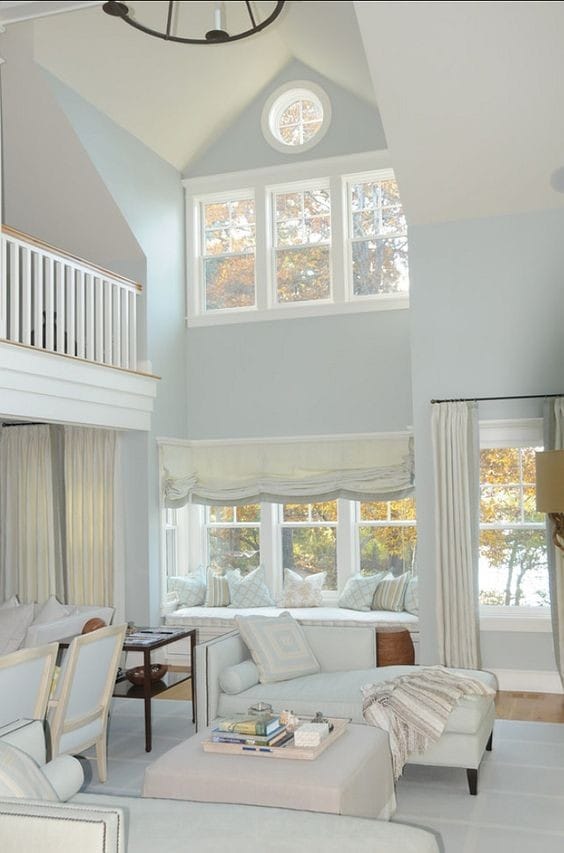
Immerse yourself in a calming ambiance, courtesy of this soft, diffused lighting. Its gentle quality has a profound impact on reducing stress levels, creating an atmosphere that’s both soothing and rejuvenating. Moreover, the low intensity eliminates the risk of eye strain, even when gazing at a fixed point for extended periods.
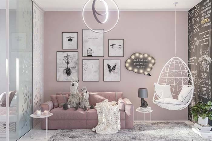
Choose the Perfect Shade of Purple for Your Child’s Bedroom
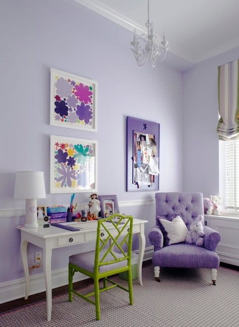
When selecting a color for your nursery, consider pairing soft purple hues with subtle gray undertones. This combination will tone down the brightness of the purple and create a calming atmosphere perfect for a little one’s bedroom. The same approach can also be applied to other rooms in your home where you want to add a touch of elegance without overwhelming the senses.
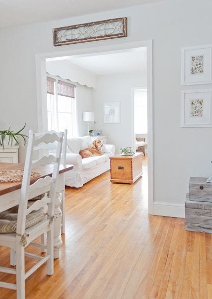
Breathe Life Into Your Home with Gray
The humble gray color is often misunderstood as being dull and uninteresting, but in reality, it’s incredibly versatile. When paired with other colors, gray can be surprisingly harmonious. For instance, by incorporating brown undertones, you can add warmth to the palette without sacrificing its calming effect. In fact, gray is a fantastic choice for those seeking a soothing atmosphere that promotes tranquility and relaxation.
Neutralize Your Home Decor with Sage Green
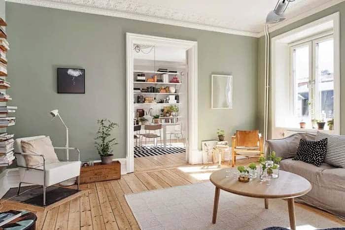
As visual inspiration abounds on Pinterest, a distinct neutral color trend has emerged. The fascination with soothing hues like this one is hardly surprising, given our collective quest for serenity. According to Pinterest’s latest insights, searches for soft, serene green have skyrocketed, driven by a desire for desaturated, grayed-out, and almost chalk-like or matte finishes.
Give Your Kitchen a Modern Look with White
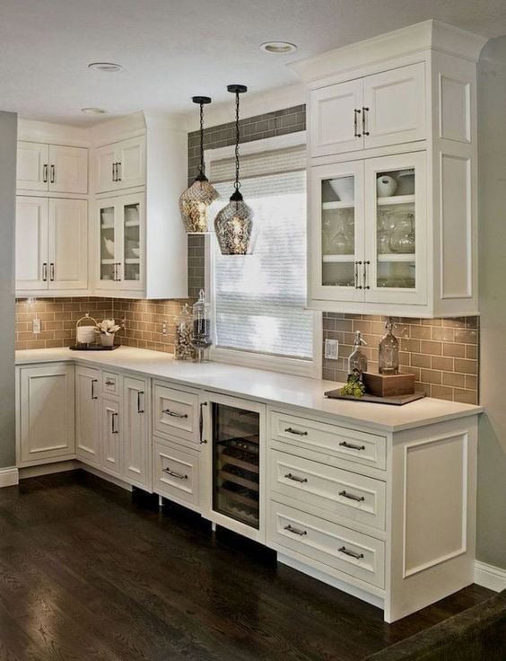
When it comes to choosing a color for your kitchen cabinets, pure or snow white might seem like an obvious choice. However, if you’re spending extended periods in the kitchen, this bright hue can actually be overwhelming and even tiring for the eyes. A more practical solution is to opt for cream white or antique white cabinets instead. These softer shades will help to diffuse the light that reflects off the surfaces, creating a more comfortable and inviting atmosphere in your kitchen.
Beautify Your Walls with Misty Gray
Sherwin Williams’ Misty Gray is an excellent choice for creating a tranquil atmosphere in your space. This versatile shade can seamlessly blend with warm-toned flooring options, making it perfect for areas where you want to evoke a sense of serenity.
Create the Perfect Bedroom Getaway with Sea Blue
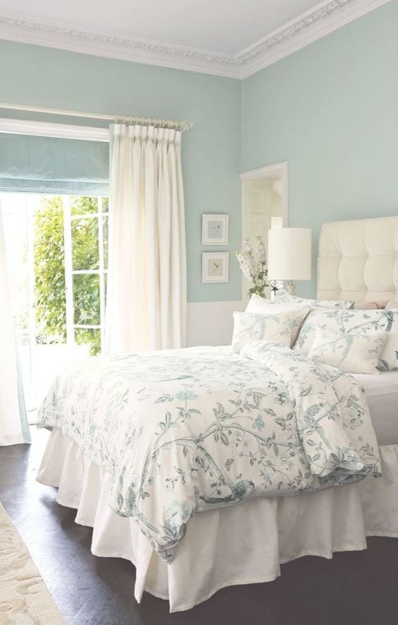
The calming essence of the ocean can’t be overstated. Its tranquil ambiance has a profound impact on our minds and bodies. It’s no wonder that sea-inspired hues like blue are often favored in bedroom design, particularly when paired with neutral color palettes. In fact, this soothing shade complements cream tones beautifully, creating a harmonious and relaxing atmosphere perfect for unwinding.