When selecting curtains for a room with a blue wall, it’s essential to consider several factors beyond just the wall color. While personal style and overall aesthetic are crucial considerations, the shade of blue on the walls also plays a significant role. A pale blue wall can evoke serenity, while a navy blue wall can create energy. The right curtain color can enhance or contradict this mood, so it’s vital to consider both the tone and hue of the wall color.
For instance, green curtains might be an unconventional choice for a colonial revival-style room with dark blue walls, but could be perfect for a coastal-inspired space. Similarly, the style of the room will influence curtain fabric and draping, with sheer fabrics often preferred in lighter rooms and more substantial materials used in formal spaces. Sash curtains, which sit within window frames, are typically made from thinner fabrics to allow in more natural light.
Cream
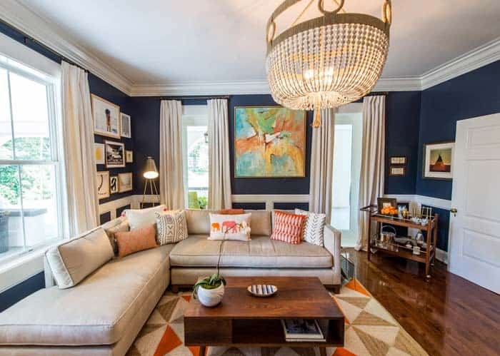
When it comes to incorporating cream into your design scheme, one of its most appealing qualities is its ability to serve as a versatile neutral shade. The subtle undertones of yellow within cream allow for harmonious pairings with blue tones in the color wheel, making it an ideal choice for balancing bold or bright hues. In this particular example, we see how cream beautifully complements warm shades like brown and soft orange when paired against a rich navy backdrop.
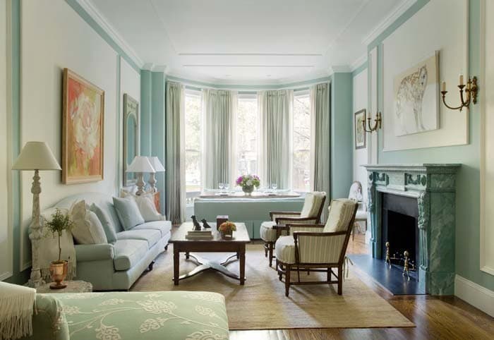
White
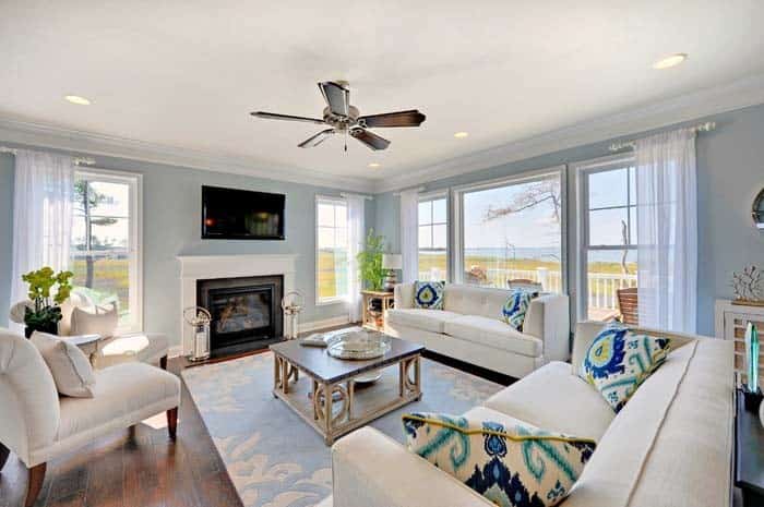
White’s versatility makes it an ideal choice for making a statement in interior design. When paired with bold colors like navy blue, it can create a striking contrast that draws attention to a specific area or feature. Alternatively, white can also complement softer hues like light blue to produce a calming and airy atmosphere. In the example above, sheer white curtains add to the room’s coastal charm by emphasizing its sense of openness and freedom.
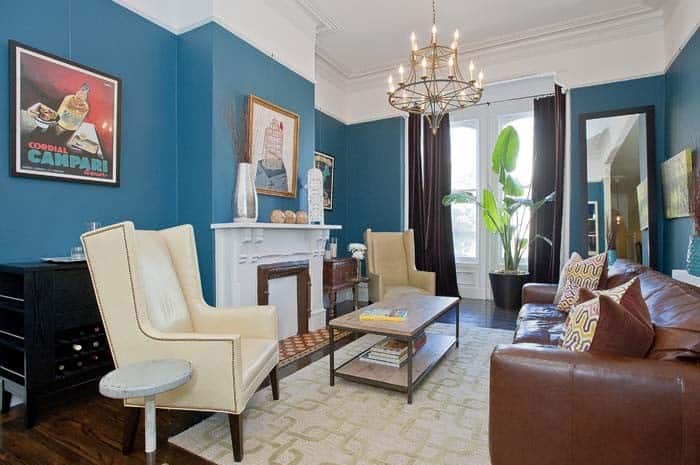
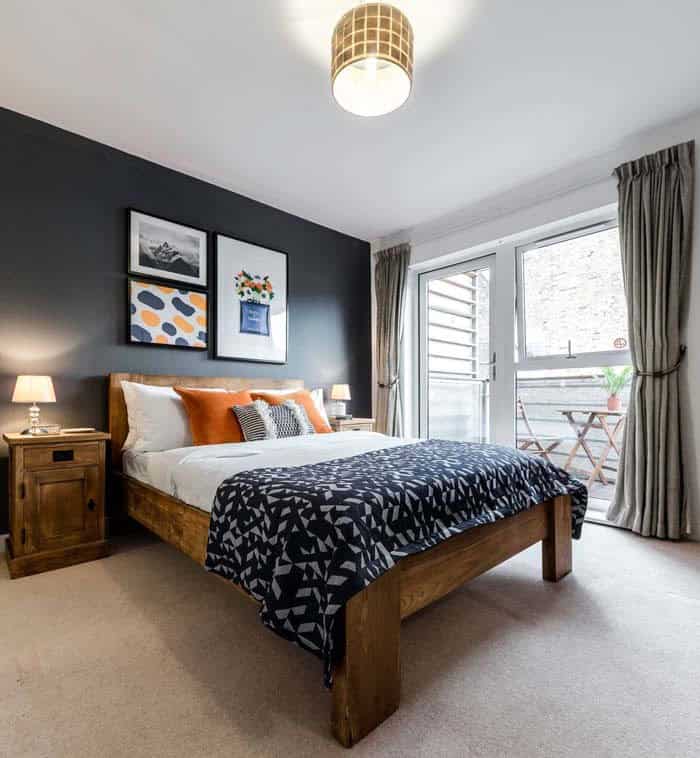
Black
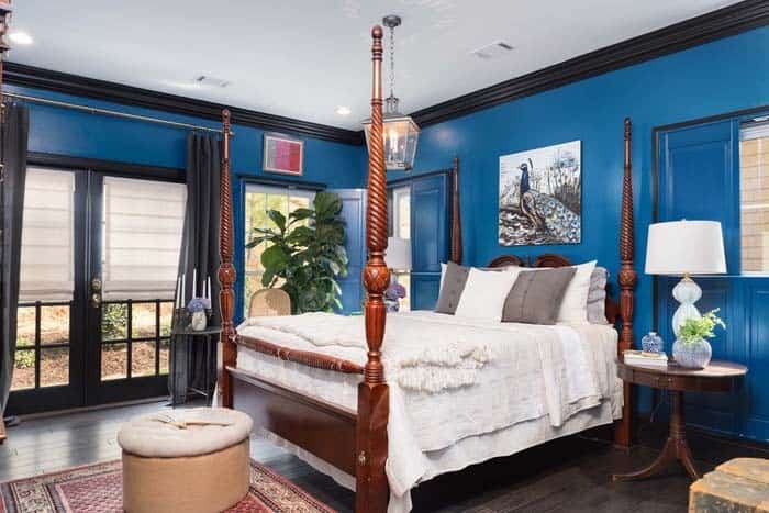
Transforming a space with black curtains is an effective way to create drama and achieve total darkness. This solution proves particularly useful when seeking a blackout curtain option. In the context of a cobalt blue room, the dark panels harmonize with molding and window trim, generating definition and visual interest in the area.
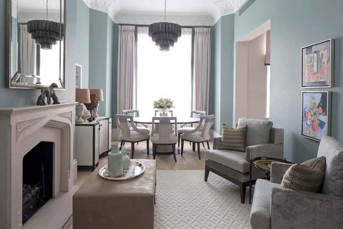
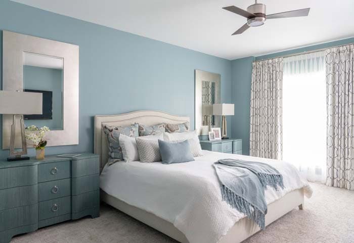
Taupe
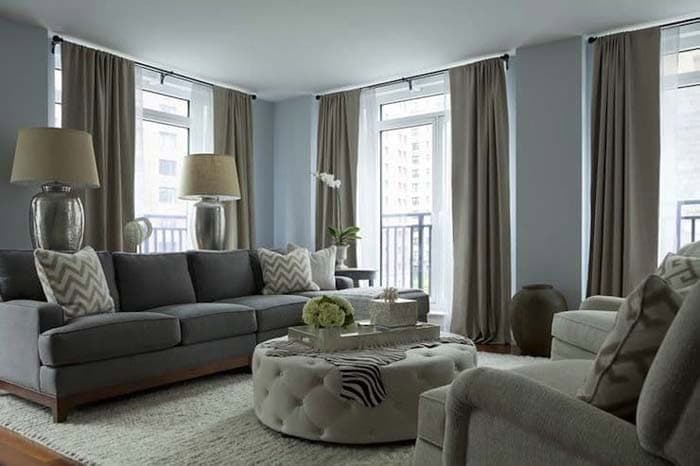
Taupe’s versatility allows it to harmonize with various shades of blue, including navy blue. When paired with cream-colored walls, taupe maintains a similar effect to white curtains. In contrast, taupe adds a sense of subtlety, reducing the dramatic impact of white curtains against navy blue walls. Moreover, taupe blends seamlessly with soft neutral palettes, as exemplified by this living room featuring a gray couch and beige accents.
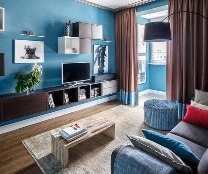
Brown
When it comes to combining warm colors, brown and blue make for a harmonious pair. The earthy tone of brown is particularly well-suited when paired with thermal insulated curtains, as the darkness effectively blocks out light. Additionally, this color combination is naturally complemented by dark stained furniture, creating a cohesive look that’s both soothing and inviting.
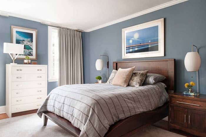
Navy Blue
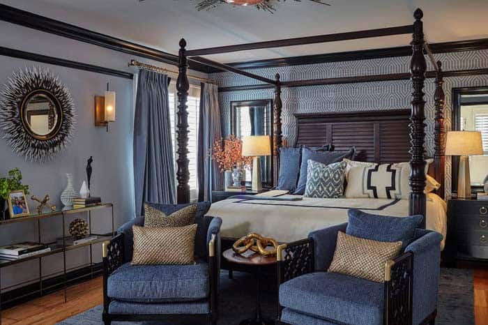
While it may seem counterintuitive to pair a blue curtain with blue walls, this combination is more common than you might think. In fact, a lighter blue wall can be beautifully complemented by navy blue accents or furniture. By matching the curtain color to these existing elements, you can create a sense of cohesion and unity in your room. The key is finding the right balance between the different shades of blue to avoid visual overload.
Blush Pink
Blush pink’s soft coastal charm pairs harmoniously with muted tones like those in the room above, where cream-colored rugs, soft gray chairs, and light teal walls blend seamlessly together. When used with the right tone of blue, it exudes sophistication; however, if the colors become too vibrant, they can give off a childish vibe.
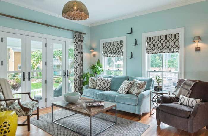
Aqua
For a coastal-chic look in your room, Aqua is an excellent choice for wall color. Its light blue-green hue evokes feelings of serenity and calmness, especially when paired with sheer or semi-sheer fabrics that add to the airy ambiance. Moreover, Aqua beautifully complements muted Coastal colors and neutral palettes reminiscent of sandy shores, creating a harmonious and soothing atmosphere.
Pink
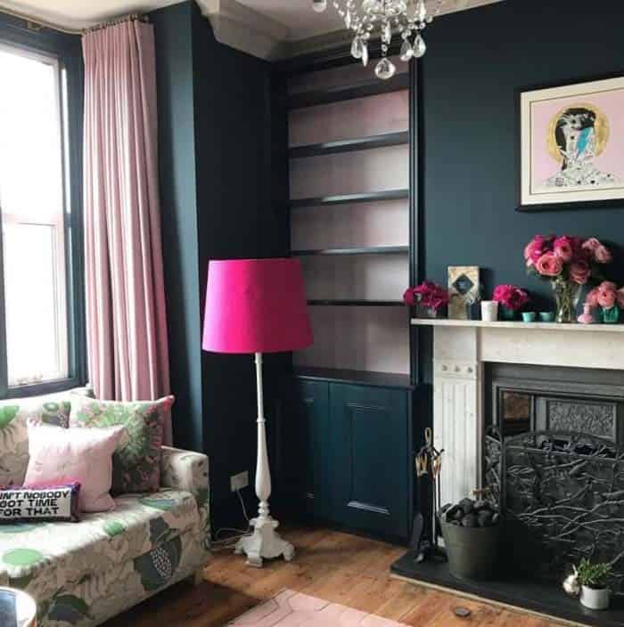
Pink has transcended its traditional associations with femininity to become a bold and daring choice for everyday spaces. A prime example is this living room, where deep blue walls serve as a striking backdrop for the room’s pink accents. The result is a harmonious blend of contrasting hues that exudes a sense of sophistication and glamour. Feminine touches abound, from the stylish pink lamp shade to the elegant bookshelves featuring a subtle pink undertone.
Meanwhile, the classic crystal chandelier adds a touch of luxury, further elevating the room’s overall aesthetic.
Light Blue
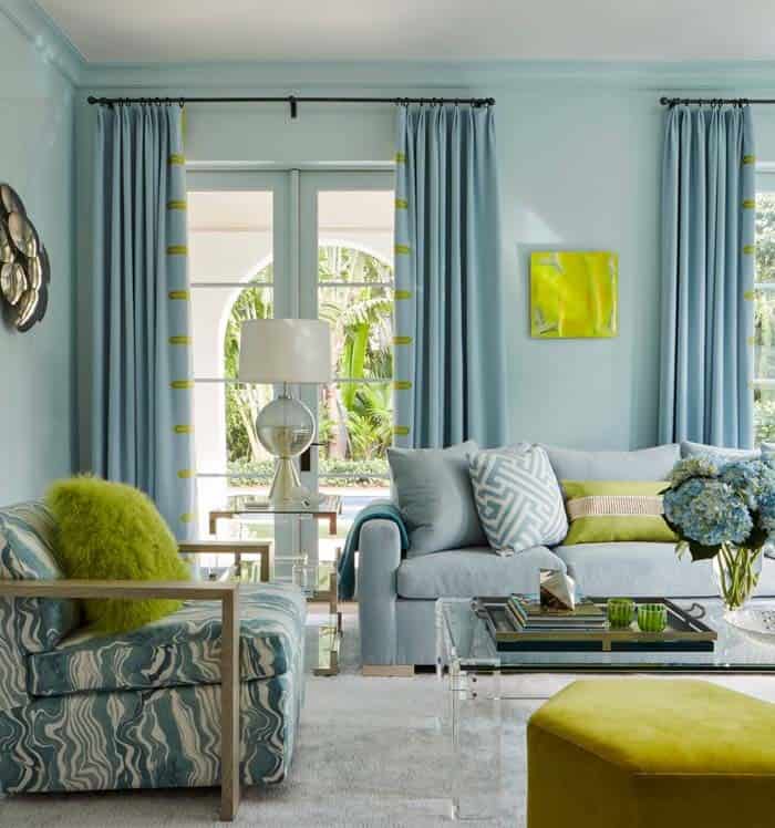
Light blue’s calming effect can be amplified by pairing it with walls of an even lighter shade, creating a sense of serenity in any space. Meanwhile, introducing lime green accent pieces can inject a vibrant tropical feel, harmoniously complementing the light blue palette.
Gray and White

Infusing a masculine charm, gray and navy bring depth and modernity to the space. By combining these colors with white, you can avoid the nautical cliche and create a sophisticated atmosphere. The contrast between dark gray accents and light gray bedding and furniture adds visual interest. Meanwhile, sheer curtains allow an abundance of natural light to illuminate the room, further refining its polished appearance.
Yellow
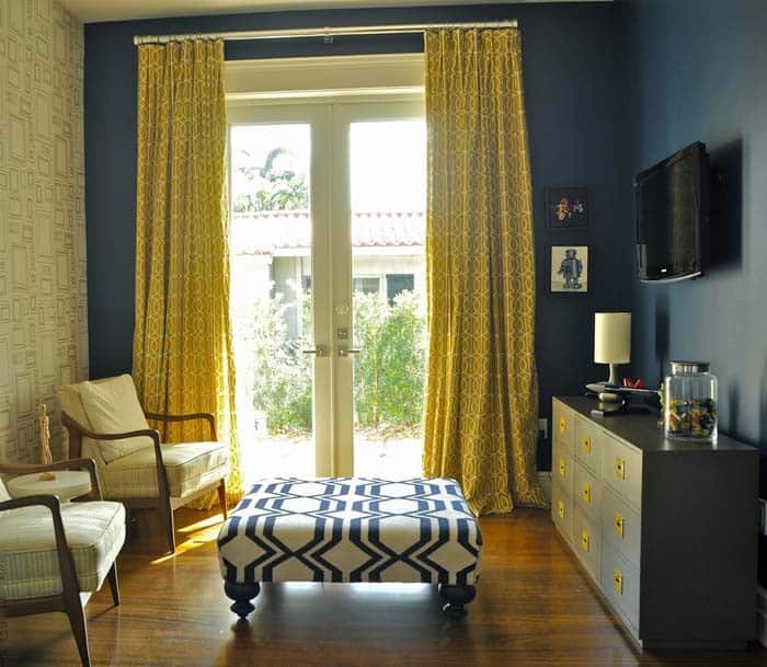
To inject energy into a room, pair yellow curtains with dark blue walls. The combination will not only create a visually appealing contrast but also help to bounce and reflect light around the space. To take it to the next level, incorporate shiny gold or brass accent pieces, such as the dresser hardware featured in this design, which will add a touch of sophistication and depth.
Gold
Elegance is effortlessly achieved when incorporating shimmering textiles into a room’s modern design. The added glamour of gold brings an unparalleled level of sophistication. As seen in the previous example with the yellow curtains, shiny elements and textiles are strategically used to amplify the reflective energy of the space, resulting in an even more radiant ambiance.
Brick Brown
When it comes to pairing colors, the combination of brick and sky blue is a match made in heaven. The warm tones of the brick complement the calming atmosphere of the sky blue perfectly, creating a cozy and inviting space. The addition of the color block at the bottom of these panels adds a pop of visual interest, further enhancing the overall aesthetic.
Irini Krashennikova’s design effectively showcases how brick and sky blue can work together in harmony to create a sense of comfort and serenity.
Circle Patterned
By incorporating a patterned curtain into the design, you can effortlessly introduce texture and visual appeal to a space without compromising harmony. In this instance, the circular pattern creates a sense of intrigue, effectively elevating the art deco-inspired room’s aesthetic without competing with the furniture or bed linens.
Brown Pattern
To harmonize with the existing design, a subtle brown pattern is incorporated into the curtain fabric, seamlessly extending the warm brown accent tone from the room’s features while still allowing the calming aqua walls to remain the focal point.
Ecru
Ecru, often reminiscent of linen’s natural hue, boasts a soft brown undertone that lends itself to creating a warm and inviting atmosphere. When paired with beige-toned furnishings, ecru becomes an excellent substitute for linen curtains, allowing you to achieve the look of unbleached linen without the need for actual linen.
Light Gray
When pairing blue walls with window treatments, grey curtains are a timeless and harmonious choice. The subtle neutrality of light grey curtains allows them to seamlessly complement a range of blue shades, which often feature grey undertones. This classic combination creates a sense of serenity and calmness within the room.
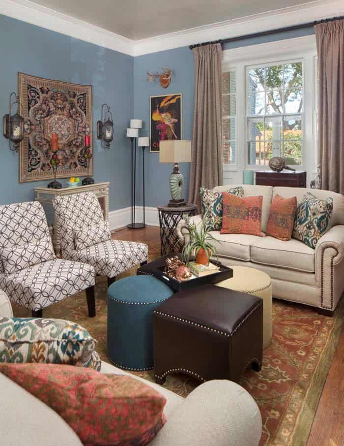
Beige
While beige curtains share some similarities with their light gray counterparts, they possess a distinct warm quality thanks to their yellow undertones. It’s crucial to view these curtains within the context of your space, as the true nature of the color is often obscured by artificial lighting conditions found in showrooms. The subtle nuances of beige can only be fully appreciated when experienced firsthand in a room’s natural ambiance.
Orange
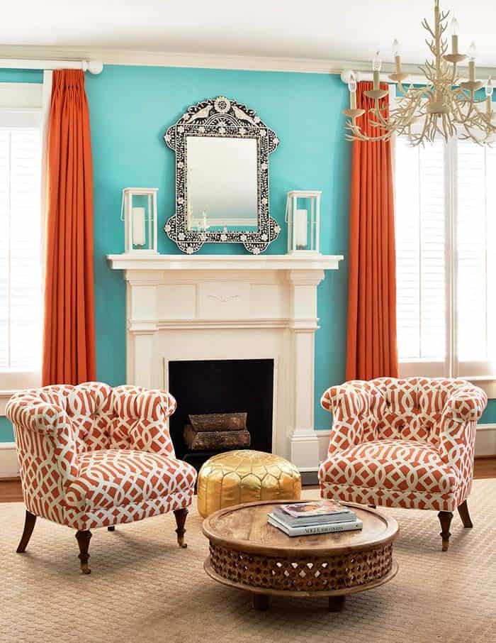
Orange is an electrifying hue that can transform any space with its bold and playful energy. In this particular seating area, the vibrant orange curtains create a striking contrast with the teal blue walls, injecting a fun and lively atmosphere into the room. This versatile color also has the ability to bring out the subtleties of neutral colors, making it an excellent choice for those seeking to add warmth and welcoming vibes to their space.