As you gaze upon your newly painted room, the once-neutral gray walls now seem to be begging for a pop of color to bring out their best features. And that’s where accent walls come in – a clever design trick that can instantly elevate the ambiance and visual interest of the space. But which colors pair well with gray, you ask? The answer lies in embracing the nuances of the greige spectrum, a realm where cool grays meet warm neutrals.
Many paint manufacturers have already tapped into this trend, offering a range of shades that blur the lines between traditional cool grays and earthy tones. Take Sherwin-Williams’ Worldly Gray, Repose Gray, Accessible Beige, and Agreeable Gray – all great options for incorporating a touch of warmth into your design. Meanwhile, Benjamin Moore’s Edgecomb Gray, Mindful Gray, and Pale Oak offer a similar blend of cool and warm undertones.
And if you’re looking for a medium shade that straddles the line between gray and beige, Sherwin-Williams’ Dorian Gray is a popular choice that’s sure to bring balance and harmony to your room. The key takeaway? When it comes to pairing colors with gray, don’t be afraid to experiment and find the perfect shade that brings out the best in both.
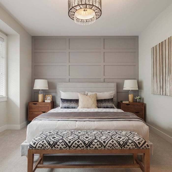
Gray
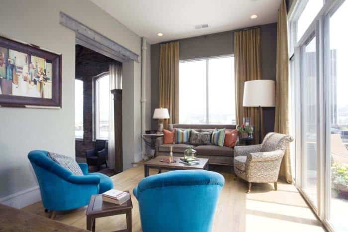
While the all-gray trend may be fading, neutrals remain a timeless choice due to their adaptability. A single neutral shade can effortlessly blend with other hues, creating a visually appealing space. For instance, pairing light gray and dark gray produces a subtle, yet effective way to divide a room. The undertones of this combination can shift towards green or blue-green, harmonizing seamlessly with elements like golden curtains and blue-accented furniture.
If you’re not ready to replace your entire furnishings but still want to update your space, consider introducing a greige tone, such as Sherwin-Williams’ Repose Gray. This versatile shade adjusts its appearance in response to natural light, making it an excellent option for those seeking a low-maintenance yet stylish solution.
Additional alternatives include Dorian Gray from Sherwin-Williams and Stonington Gray by Benjamin Moore, both of which offer a similar chameleon-like quality that can be seamlessly incorporated into your existing decor.
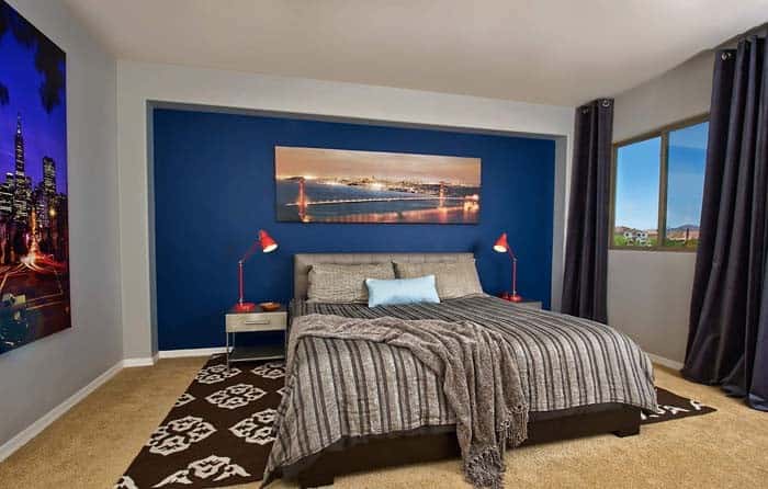
Navy Blue
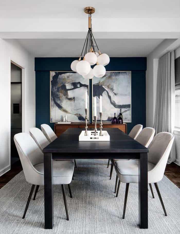
In this modern dining space, a striking navy blue accent wall creates a dramatic focal point. The neutral gray walls serve as a sophisticated backdrop for the crisp white accents and expansive artwork. Interestingly, Benjamin Moore’s Gray Owl is often paired with navy blue in color schemes, showcasing how harmonious these two hues can be.
Wood
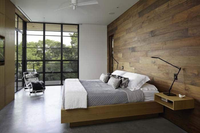
In stark contrast to rooms with opulent decor, a space with minimal aesthetic can still make a lasting impression. One such approach is to incorporate full-length windows that seamlessly integrate nature into the room’s design. This harmonious blend of interior and exterior spaces fosters a sense of serenity and calmness. A wood accent wall can further enhance this ambiance by adding warmth and texture, creating a cozy atmosphere that’s perfect for relaxation.
The combination of dark gray flooring and light gray walls provides a subtle backdrop for the natural beauty that pours in through the windows, resulting in a peaceful retreat that feels deeply connected to its surroundings.
Orange
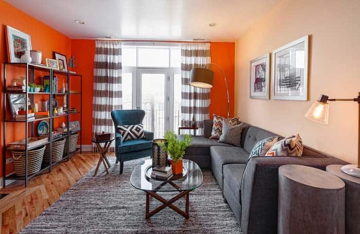
When it comes to incorporating bold accent colors into your home décor, it’s crucial to select hues that harmonize and work together seamlessly. A vibrant orange accent wall, for instance, presents a striking contrast to a gray wall with its calming cool undertones. By choosing coordinating colors, you can create a visually appealing space that strikes the perfect balance between contrasting elements.
Sky Blue
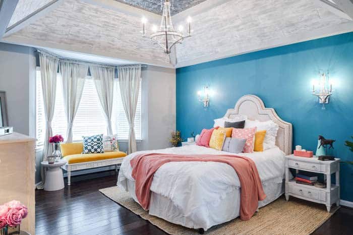
To inject vibrancy into a space, consider pairing a neutral shade like gray with subtle undertones of green or blue for a harmonious contrast. This striking combination can be seen in the matching hues used for the curtains and ceiling.
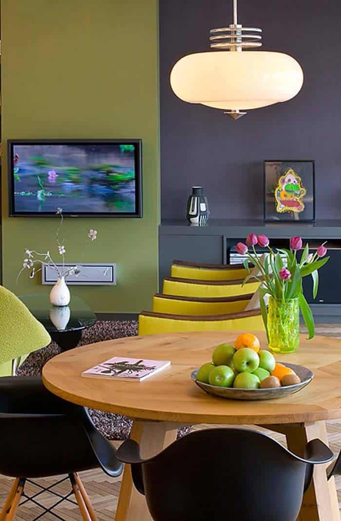
Jade
Jade’s subtle blue-green undertones are expertly complemented by the warm hint of yellow tones, skillfully woven into the room through the use of gold pillows and curtains. The vintage chandelier, with its rustic charm, takes center stage, its bulbs radiating a golden glow that harmonizes beautifully with the yellow undertones. This unique color combination is further enhanced by Sherwin Williams’ Agreeable Gray, which forms a beautiful union with jade and jasper.
Brown
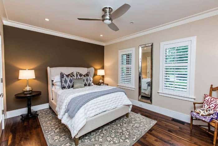
The harmonious union of gray and brown creates a versatile foundation that easily pairs with a wide range of colors. This neutral marriage allows for effortless integration of additional hues, as demonstrated by the incorporation of slate blue accents that complement the blue undertones in the gray walls. For a cozier atmosphere, consider introducing warm tones through shades of greige, which will amplify the room’s warmth and create a welcoming ambiance.
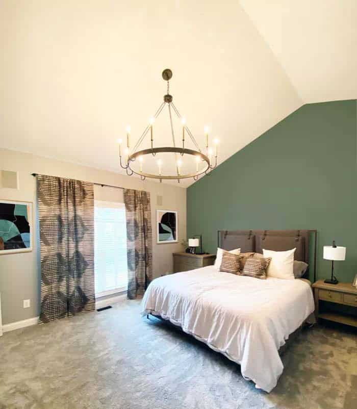
Sage
When designing a space that incorporates sage hues, it’s essential to consider the color’s inherent yellow undertones. A gray palette with subtle green undertones can create a harmonious balance, as seen when paired with the golden tones of a wooden bench and natural fibers in an area rug. This thoughtful combination ensures a visually appealing atmosphere.
Sapphire Blue
Jewel-toned hues create a striking visual impact without overwhelming the space. When seeking to introduce a bold, masculine atmosphere, gray walls provide an ideal neutral backdrop for anchoring deeper, richer colors like sapphire blue. Here, this combination is particularly effective in bringing out the vibrancy of blues throughout the room, as seen alongside warm chocolate brown. The result is a harmonious balance of contrasting elements, as showcased by Mackenzie Collier Interiors.
Brick
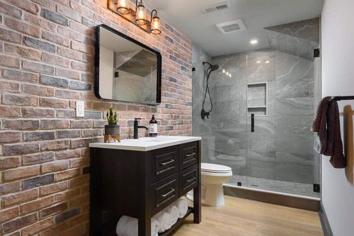
When it comes to accent walls, the reddish-brown tones of brick provide an ideal complement to a wide range of gray shades. To truly bring out the rich hues in the brick, opt for a light gray tone that won’t overpower the warm undertones of the brick. One of the best aspects of incorporating a brick wall is its accessibility – today, you can easily find brick facades at most home improvement stores, including Lowe’s and Home Depot.
Lime Green
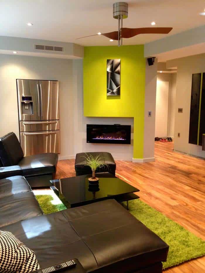
In this space, lime green stands out as a vibrant and striking accent, perfectly balancing the neutral tones that dominate the room. The subtle hue of gray complements the warm tones of the brown wood floor and leather sofa, creating a harmonious visual relationship.
Lavender
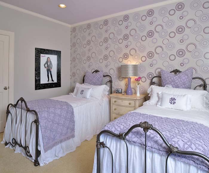
Lavender has undergone a transformation, shedding its former reputation as an old-fashioned hue. Today, it’s celebrated for its calming properties and natural beauty. This shift in perception presents an opportunity to incorporate lavender into interior design, particularly in feminine spaces where pink may be overused. By pairing gray walls with purple undertones, you can create a soothing atmosphere that harmonizes with the renewed appeal of this once-understated color.
Stone
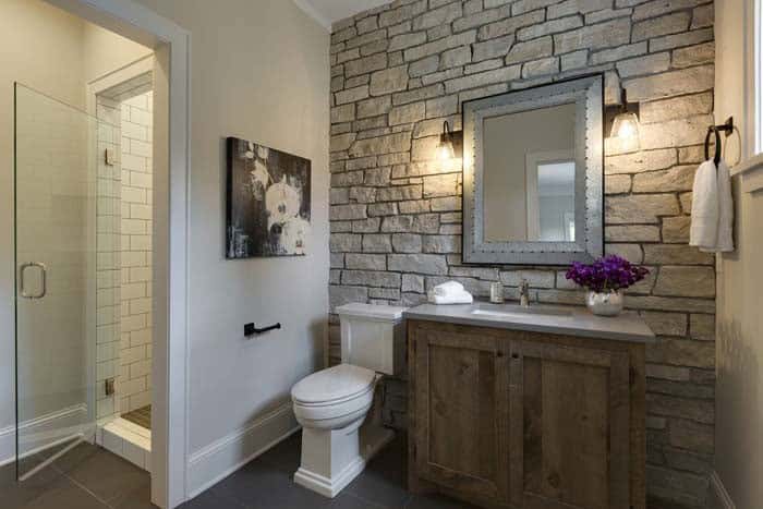
While brick accent walls are certainly striking, stone walls can also create a dramatic visual impact. To allow the stone to take center stage, opt for a neutral color palette with a gray tone that’s more on the lighter side of the spectrum. This will prevent the stone from competing with other design elements in the room. Additionally, select a dark mortar color to create a striking contrast.
For example, charcoal gray walls paired with a deeper green accent wall can produce a stunning visual effect. The light stained floors and furniture can also be used to create a nice balance. Consider incorporating this unique design element into your interior space for added style.
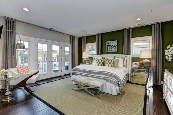
Yellow-Green
The charcoal gray walls provide a striking counterbalance to the richer, deeper green of the accent wall. This bold combination creates a visually compelling contrast with the lighter tones of the stained floors and furniture, resulting in a dynamic visual harmony.
Yellow
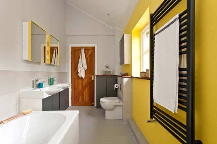
The moment you step into this bathroom, a vibrant burst of sunshine awaits. A radiant yellow accent wall serves as the perfect pick-me-up, guaranteed to start your day off on the right foot. The adjacent light gray walls, infused with green undertones, maintain a sense of energy and vitality throughout.
3D White Wave
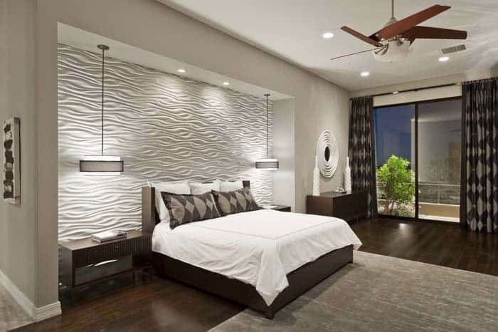
When it comes to bedroom design, accent walls can make a significant impact on the overall aesthetic. A common misconception is that pure white paint is always the best choice for walls. However, this shade can create unwanted shadows from various angles of light. To avoid this issue, you can use artificial lighting to create a dramatic focal point. For instance, consider pairing a light grey wall with green undertones and complement it with warm chocolate brown accents and wood flooring.
This combination works harmoniously together. Additionally, if you prefer the look of white but dislike the shadows it creates, Benjamin Moore’s Classic Gray is an excellent alternative. It has a subtle off-white quality that can add depth to your bedroom without the unwanted shadows.
Taupe
Taupe, a soothing and warm neutral hue, commands attention without overwhelming the senses when used as an accent wall. The calming atmosphere is maintained through its understated presence. In contrast, light gray walls provide a subtle contrast, balancing out the space with their airy freshness, while complementing the overall neutral palette.
Pink
When it comes to pairing light gray with other colors, pastel shades such as peach, mint, baby blue, and pink can create a harmonious and modern aesthetic. For instance, a pink accent wall can add a touch of sophistication to any room. To add some visual interest to your space, consider combining light gray with a shade that has a green undertone. This will not only create a calming atmosphere but also bring out the unique characteristics of the gray tone.
Alternatively, if you prefer a more soothing ambiance, opt for a gray with purple undertones. The beauty of working with gray furniture is that it provides a versatile canvas for your color choices. Simply select an undertone that complements the shade you see on your gray sofa and let the design speak for itself.